We often browse through websites after search engines throw up millions of results for our query and we often linger on a bit more time at one particular web site than others. Ever think why? As a leading Web Designing Company in Mumbai, we know that websites with lots of clutter and unnecessary distractions put us off although the content may be relevant to us. Let us now understand this concept even better with the help of this blog.
Similarly, sites can be boring if there is a lot of text, small fonts, and a little color, with whatever visuals being unappetizing to our eye. The same goes for websites that are difficult to navigate and are confusing. This is where the composition of the website steps in.
Any Web Designing Company in Mumbai that is worth its salt, will know that composition is about showcasing ideas and designs on a huge canvas as a whole. This is known as composing design. A great composition boosts user experience to a different level, especially where navigation is concerned. It also assists us in adding a graphical relevance to our layouts and helps visitors to navigate easily to their next destination on the website. Through this article, we will understand the basics of composition, which is essentially about putting things together.
1. Space
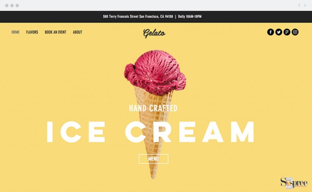
The composition is more about the intelligent usage of available space than placement. Of course, this does not imply that the viewer gets to see wide-open spaces in the design. Available space needs to be cleverly used with an emphasis on providing a focus for the content. Websites that are cluttered, with all elements in a cramped state with little or no breathing space in between.
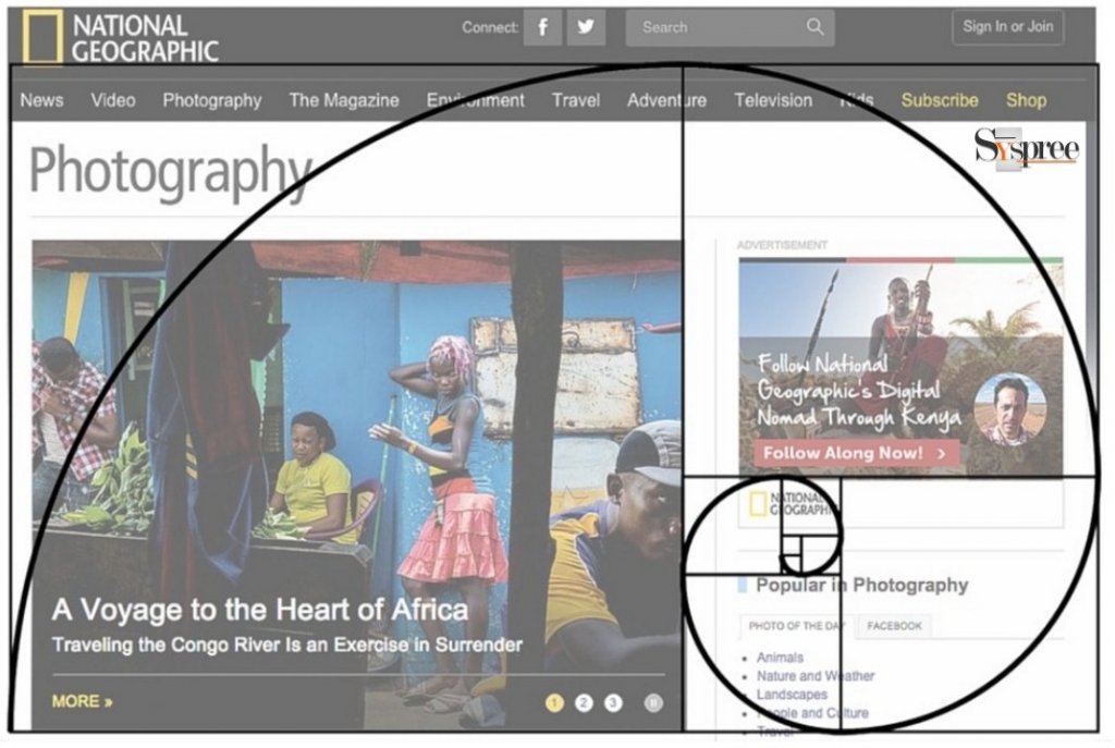
2. Golden Ratio
Easily the most recognizable composition tool or layout in any kind of design, the Golden The ratio is highly involved with mathematics. Golden Ratio, which is 1.618, defines the relationship between two proportions, and many elements in nature are known to have this ratio that makes it pleasing and reassuring to our eyes. The Golden Ratio when used in web designing, creates a harmonious balance that seems just perfect and makes absolute sense.

3. Rule of Thirds
This rule is a great compositional layout while creating designs for the web and is widely used in film-making, photography, and other related areas. This rule states that an image should be divided into nine equal portions with elements of the image aligning itself to the edges of every part. When used in web design, designs have better proportions and layouts and proves to be a great composition tool, giving design the necessary balance.

4. Colors
This is another tool that can help you accentuate various elements that help in the composition of your web design. Designers use a burst of colors to focus the attention of your users to some elements over the other. Usually, bright colors will jump from your page whereas muted colors or grayscale will deter the eye.

Apart from these, designers from any Web Designing Company in Mumbai should also study traditional compositions and layouts used for print design as these are slowly but surely finding their way into web designing and getting popular too.
According to any leading Web Designing Company in Mumbai, Thane, and Navi-Mumbai, this should be a good start for many of the users who have started researching how one can start their website. We assure you to go into further depth in our future blogs such as The Difference Between Web Development and Web Designing or The Importance of Using Split Screen Designs for Websites to learn about more exciting topics.


Nice blog! Thanks for sharing the valuable information about Composition in Web Design. This is very important and informative because every business depends on its website and its design. Keep on sharing.