As a leading Graphic Designing Company in Mumbai, we know that Web design is always evolving and new design trends are introduced regularly, giving rise to phenomenal new ideas. Web sites need a fresh infusion of ideas that are instrumental in giving the customers different online shopping experiences and through this article, we shall explore how exaggerated use of space is helping designers to do so.
Every Graphic Designing Company in Mumbai is constantly on the lookout for ideas that give a different perspective to the entire design process and exaggerated use of space is one idea that is trending in a major way.
As designers of a top-notch Graphic Designing Company in Mumbai, we all are aware that the exact volume of space on a webpage can make or break a design. Empty spaces have the power to speak to the customer, be it white space, background color, or surrounding text and images. Exaggerated use of space is a fun design trend and can be extremely effective in helping web visitors use a particular application or a website, provided it is implemented smartly.

The trend to use minimal styles, a highly popular trend, has given rise to the use of open spaces. However, there is one noticeable difference between the two; these designs balance text, images, and color in a more asymmetrical format than the symmetrical outline with lots of space around it.
Let us analyze this exaggerated use of space from the user’s point of view. A website visitor will be instantly attracted to the wide, open spaces of the webpage design and this is an extremely natural reaction from the user. From here, the visitor’s eyes follow the highly populated part of the design and seems like an unforced, natural progression. Both these steps are designed to grab the user’s attention and lead them to where we want them to look and engaging them for a longer time.

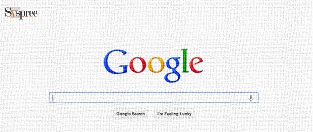
This is a fairly simple balance the designer tries to create, which is not only great for making a great impact but is visually attention-grabbing too. Website designs use black and white spaces quite effectively since the dark and light elements attract the viewers and are great for creating an impression on the viewer. Similarly, wide and empty spaces around the headline are useful in drawing attention as the headline is the first thing a viewer should get connected to and helps engage them further.
How to leverage white spaces effectively?

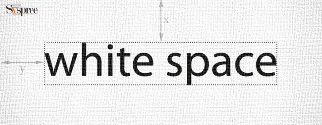
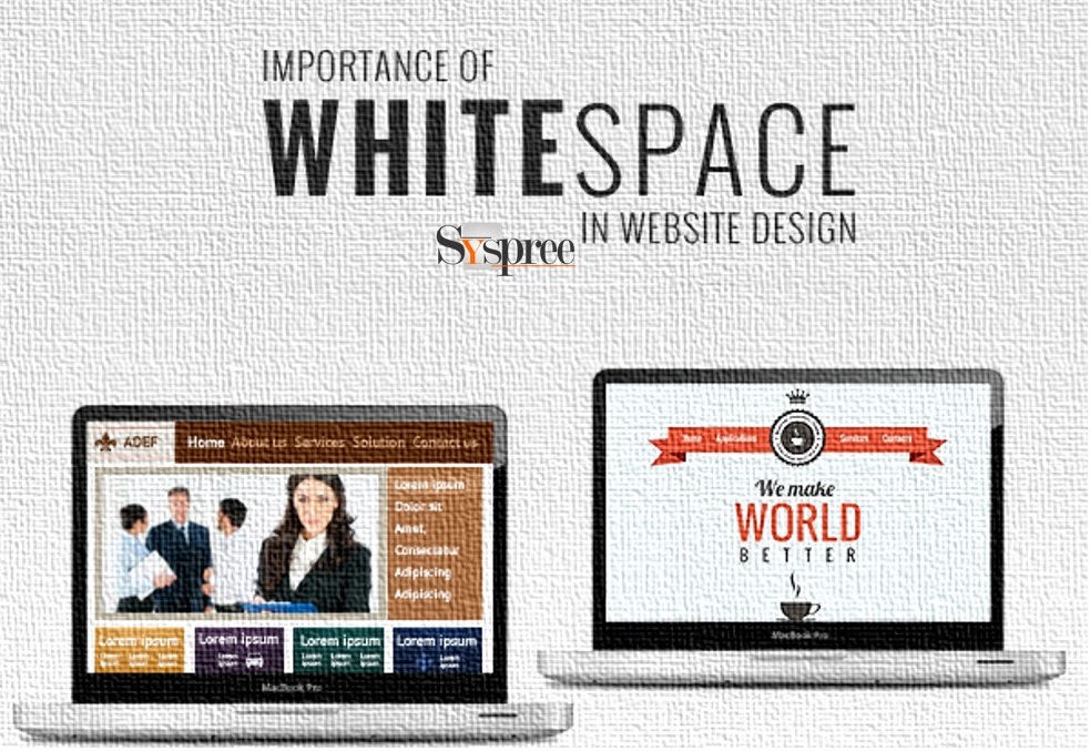
White space is more than often ignored yet it remains a vital part of effective website design. Clients and many designers think that every open space on a webpage has to be filled with images or text or colors since space is seen as waste if not occupied. It has been observed that white space is one of the most important portions of a website and does not need to be filled just for the sake of doing so.
White space is instrumental in improving the appearance of a website since it gives it a nice, clean, and professional look, thus drawing viewers towards it. It is also quite easy on the eye and encourages viewers to stay on the page, reading and exploring the website for a longer time. White space around images and text makes the content legible while helping to improve comprehension. If brings a sense of calm and the website seems organized and clutter-free. It will also ensure the visitors do not miss items of importance on your website.
If an organization hires a professional Graphic Designing Company in Mumbai, they can be assured of proper use of the white space in the design like for highlighting call-to-action and other important parts of the website.


Awesome post, thank you for sharing this amazing information. Really helpful information.
Wow, I really appreciate your content & it really inspired me, I have already referred it 2 of my friends and I am happy to say that they also pleased with this kind of knowledge & then they referred me to this site to gain extra knowledge responsive web design
Hello, This blog is very helpful!
Thanks for posting.
Thank you for sharing your views with us. We are glad you did that!
Thank you for sharing your views with us. We are glad you found this blog useful!
This Blog is very nice and helpful!!
MESHWORK TECHNOLOGY is the most leading Web Development Company in India which provides you with affordable website development services at your convenience. Optimize your business’s value and increase your market worth, reach, and trust, by connecting our organization to your target audience and clients, through your intranet, or internet website. This is a one-stop-destination for your business needs! Meshwork Technology has a lot to do than just building a website for you!
Thank you for sharing your views with us.
Hello, This is really too useful and have more ideas from yours. keep sharing many techniques. eagerly waiting for your new blog and useful information……nice…….
Visit website: “https://ignatiuslab.in/”
Thank you for sharing your feedback. Check out our latest blog What is SEO: Basics of Search Engine Optimization
Well Written Article! I found this article so informative and very helpful for me. Also, keep sharing more information like this, and Thank You for sharing this post.
Thank you for your kind feedback.
Thank you for this awesome blog. You are giving a professional touch to your content. It makes your article worth reading. Looking forward to learn more from you. I really appreciate your effort.
Thank you for your kind feedback on our blog.
This blog is very helpful to me learn new thing. good Job!!!
Hello, we are glad you found this blog to be useful. Do check out our latest blog: Broken Links: How to find & fix them? 2022 Descriptive Guide.