Cards have become the goto structure for a container style design on a website. As a leading provider of web designing services in Mumbai, Thane, and Navi-Mumbai, we have used this structure many times, and hence with the help of this blog, we aim to explain to our readers the importance of using cards on your website.
What are Cards in Website Design?
Seen those tiny rectangular patterns housing images and text, on websites? They are massively successful in the field of web design as they are not only easy to use but are aesthetically great looking too. Every kind of website from entertainment to real estate has found them to be useful and effective with all kinds of audiences. They sport a unique container kind of design and are capable of unifying huge amounts of content- be it main text, images, headlines, and the all-important call-to-action too.
As a professional organization offering web designing services in Mumbai, Thane, and Navi-Mumbai we implement the card design based on the client’s needs and choices. Since the cards focus on clarity and consolidation, this design can be easily employed for mobile and responsive designs too, and have become a highly reliable partner to structure the website. Post becoming a trend, card designs have proved their practicality and worth.
When card designs were initially introduced in the world of web design, Twitter and Facebook immediately took to them and placed them on their mobile and desktop sites. It made great sense for these activity-heavy sites to pool the information together using the card design and they became quite popular too. As a popular web designing services in Mumbai, Thane, and Navi-Mumbai, we are keen to implement such high impact designs for our client sites.
Understanding Various Types of Card Formats:
The container-style designs, provided by any leading providers of web designing services in Mumbai consist of Pins, Metro designs, Grid/Masonry, and Magazine style and are highly popular. Let us understand each of them in detail.
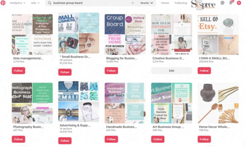
1. Pins: The best example of this is Pinterest, where each element is added as a pin on your site. The only problem that arises with this format is that the card layout can feel inconsistent with the internal or external pages that one would arrive at upon clicking each of these cards.

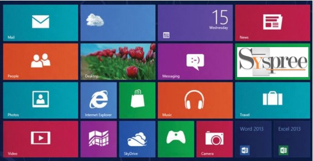
2. Metro and Flat Design: This format originated in 2006 and was the earliest representation of the flat design, adopted by Microsoft.

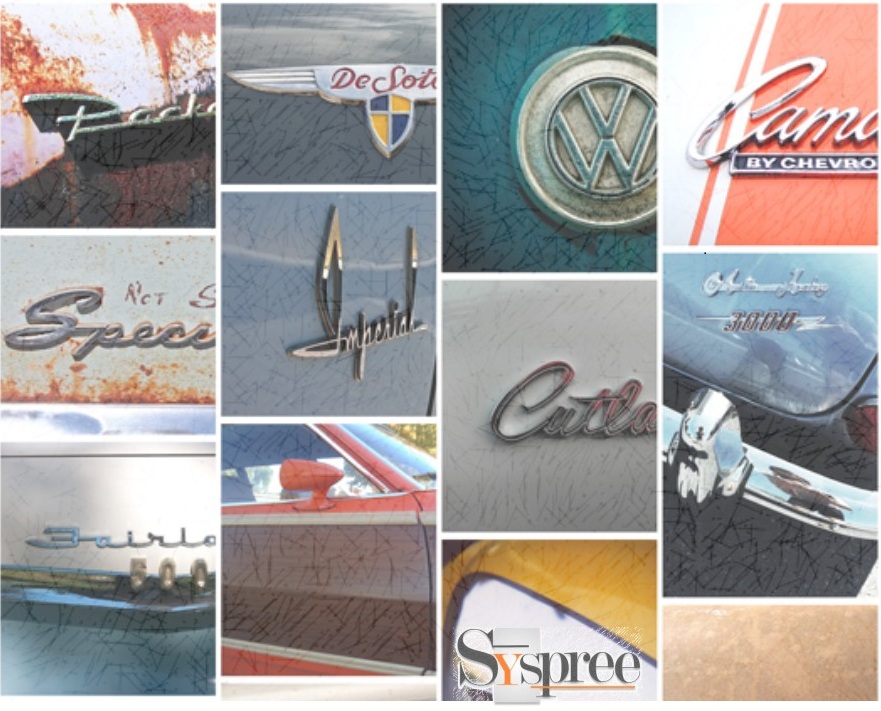
3. Grid or Masonry: A grid format consists of blocks of contents which can be either spaced out or connected layout.

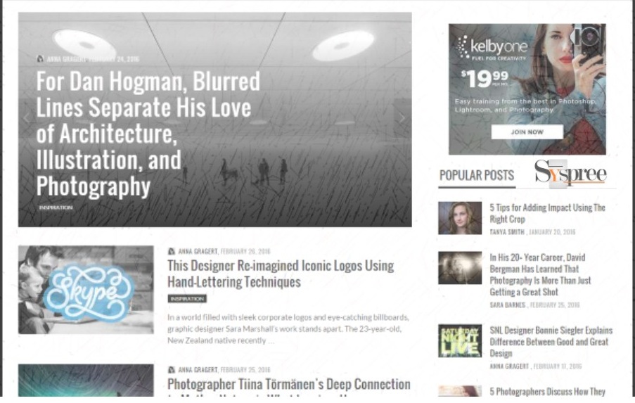
4. Magazine style: This format was exclusively used for news and magazines but is now prominent in blogs and portfolios too. It requires a strong visual balance because of the multiple categories of the cards.

Highlights of using Cards:
Following points are the reason why one should opt for cards:
- Responsive
- Organized
- Easy to read
- Social Media Friendly
- Universal
- Rank Free
Conclusion:
If you understand the structure well, you will realize that the card design prompts for a singular action-mostly to click and explore the site further, although they are just a cluster of texts, images, buttons, etc. These cards are extremely responsive and are quick to adjust to a variety of screen sizes.
If you enjoyed reading the above blog and would like to indulge yourself into more such interesting reads related to Digital Marketing or would like to know more about the services of the leading providers of web designing services in Mumbai, Thane, and Navi-Mumbai feel free to check out our latest blogs on What is Digital Marketing? or The 4Ps of Digital Marketing.


