As a leading Web Design Company in Mumbai, Thane, and Navi-Mumbai, we at SySpree understand the importance of implementing Hamburger Menu in Websites and thus with the help of this blog we intend to engage our readers in the same. Let us start with understanding what exactly is a Hamburger Menu in the following section.
What is a Hamburger Menu?
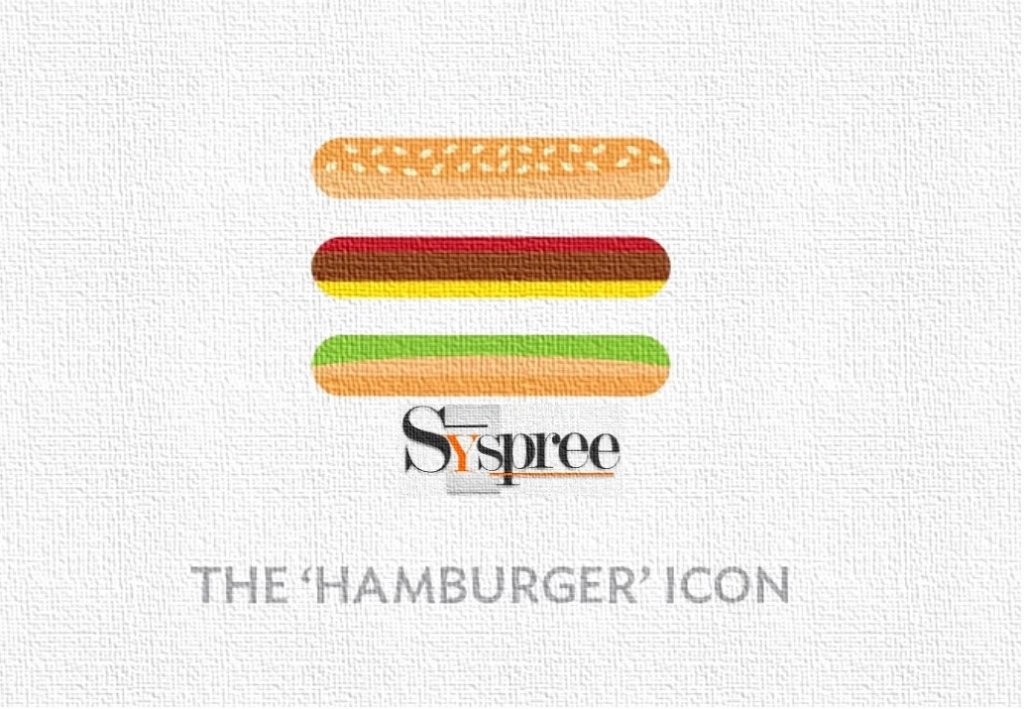
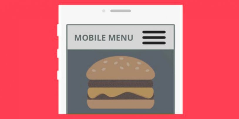
A Hamburger Menu is an icon that appears on your website, which when clicked opens the navigation menu allowing the user to select a category of his choice from the list. Visually, a Hamburger Menu appears as a stack of three horizontal lines, resembling a hamburger.

Way back in the early eighties, Xerox designer Norm Cox created the Hamburger icon with a simple purpose in mind: To point toward a list inside the Xerox Star system. It did not have too many takers and appeared randomly on websites until the dramatic and ongoing rise of smartphones prompted designers to bring it back from the dead.
As many menu items as possible needed to be accommodated (squeezed, rather) as the mobile world was gravitating towards smaller screens. We are a top-rung Web Design Company in Mumbai, Thane, and Navi-Mumbai and we bring out such functional changes and additions with regularity.
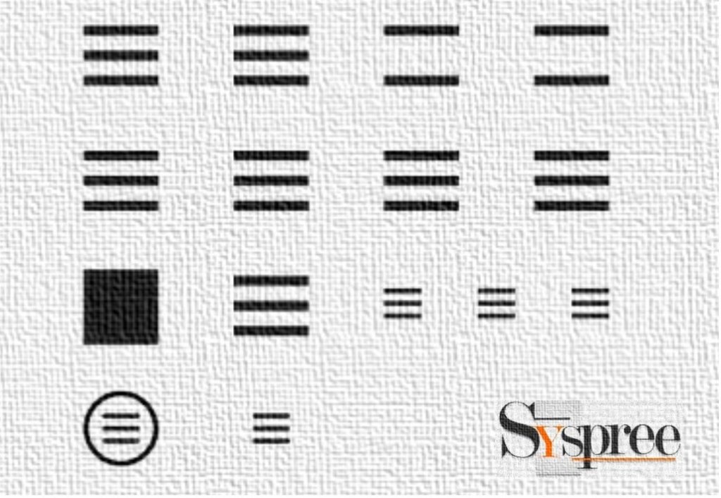
Hamburger Menu is often called by many other names including Sandwich, Hotdog, Pancake, Double Oreo, Side Menu, Navigation Drawer, Tribar, or Triple bar, Options Button, Hamburger Button, Hamburger Option, or Hamburger Icon.

Advantages:
- Well Recognized: Hamburger menu is a universally recognized standard for navigation that doesn’t need any sort of translation into other languages.
- Direct Navigation Access: It allows the user to access the section he is looking for easily without letting him scroll through the entire page.
- Makes Navigation and User Interface (UI) more clear: With the help of a Hamburger menu, you let your users focus on the core functions of your website by displaying primary navigation options and keeping the secondary list hidden until required.
Hamburger Menu in 2020
The hamburger menu is now recognized as the one for navigation consolidation and has become a common feature on almost all website layouts. Many popular websites such as Adidas and The Wall Street Journal have employed the Hamburger Menu on their site. The responsive design further accentuates the usefulness of the hamburger menu and gives it a clean and completely uncluttered look to the layouts.
Due to the hamburger menu, designers were able to make the most of the limited space they had at their disposal. This versatile menu displayed navigational selections and headings only users clicked on the symbol, thus keeping it discreet and mostly invisible at the top left or right side of a desktop or mobile site.
As a Web Design Company in Mumbai, Thane, and Navi-Mumbai, we at SySpree are engaged in the continuous upgrading of website technology, we have incorporated the hamburger menu for our clients to enhance its functionality and look. Designers love the menu as it not only provides great functions but remains almost invisible too. It has promoted minimalism to the hilt in terms of functionality and design.
It scales down the importance of other elements thus allowing complete focus on the important value proposition of the site. We are a highly creative Web Design Company in Mumbai and we excel in crafting delightfully impressive websites.
If you enjoyed reading the above blog and would like to indulge yourself into more such interesting reads related to Digital Marketing or would want to know more about the services of the leading Web Design Company in Mumbai, Thane, and Navi-Mumbai feel free to check out our latest blogs on What is Digital Marketing? or The 4Ps of Digital Marketing.


