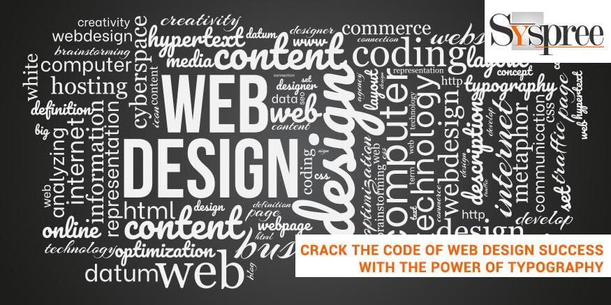
Welcome to our blog, where we reveal the secrets of web design’s success by using the potential of typography. In the vast online world in which visual quality and usability are the top priorities, typography plays a crucial role in creating websites that draw and delight users.
A top web design company in Mumbai states that typography, which is often undervalued, is more than simply choosing fonts and organizing text. It is the most important factor in creating brand identity, stirring emotions and leading users through a smooth journey. If you can crack this code, you can unlock the potential of your website designs and create a lasting impression for your users.
Key Takeaways:
- Typography can enhance marketing by conveying the brand’s personality, creating recognition, and creating a consistent brand experience.
- Understanding the fundamentals of typography, like the key terms and components, are essential to a successful web design.
- Selecting the appropriate fonts considers things like legibility, branding alignment, contrast, and hierarchy.
- Strategies for pairing fonts, such as juxtaposition pairing and complementary pairing, aid in creating pleasing and harmonious designs.
- Techniques for typography like making contrast using the weights and styles of fonts and using texture and color to enhance the aesthetic appeal of web design.
How Typography Can Enhance Branding
Typography is essential in enhancing branding by creating an essence of the brand’s character, values, and identity. The correct choice of typography will evoke certain emotions, create an image, and make an impression that lasts for the people who read it.
A consistent and well-executed style of typography can help to distinguish the brand from its rivals and allows it to be noticed in a highly competitive market. By aligning the typography with the attributes of a brand, such as tone, audience, and values, Typography becomes an effective instrument for telling stories and communicating your message effectively.
It is an aesthetic language that resonates with the target audience, establishing trust and loyalty and an impression of authenticity. It can be done through customized typography, a unique combination of fonts, or a uniform application across various brands. Typography improves branding by strengthening the brand’s personality, resulting in an integrated brand experience and leaving a lasting impression on the viewer.
Understanding Typography Basics

Understanding Typography Basics
Typography is an integral element of web design that dramatically affects a site’s visual appeal and readability. Before you can get into the complexities of the art of writing, it’s crucial to grasp a good understanding of the fundamentals. Let a brilliant creative agency in Mumbai guide you about this art of writing.
-
Anatomy of Typography: Key Terminology
To comprehend the nuances of typography, it’s essential to be familiar with the key terms that are associated with it. Here are some keywords:
Typeface: A typeface is the design of letters with the same visual characteristics. For instance, there are Arial, Times New Roman, and Helvetica.
Font: A font identifies the style in weight, size, and style within the typeface. For example, Arial Regular, Arial Bold, and Arial Italic are different fonts that are part of Arial. Arial typeface.
Glyphs: They are the individual characters in a typeface, including numbers, letters, punctuation marks, punctuation marks, and symbols.
-
Typography Elements: Fonts, Sizes, and Styles
Sizes, fonts, and styles are vital elements that affect the overall typographic style and impact. Let’s look at each of them:
Fonts: Fonts play an important role in setting the tone and atmosphere of a site. They are available in various categories like serif, sans-serif script, display, and many more. Serif fonts are characterized by small, decorative strokes placed at the end of each character, whereas sans-serif fonts do not have these strokes, resulting in a cleaner, more modern design.
Font Sizes: Choosing the appropriate font sizes ensures readability and organization. Headings usually contain larger font sizes to attract attention, while body text needs smaller font sizes to ensure a comfortable reading. The font sizes are measured in pixels (pt) (px) or points (px) and must be adaptable and flexible for various devices.
Typography: Types comprise bold, regular and underline, and other styles. These font styles allow designers to focus on specific words or phrases and to create visual interest in the text.
Exploring Typography Hierarchy and Structure
The structure and hierarchy of typography help create visual order and aid users in understanding the information. A leading web design company shares the essential elements to take into consideration, including:
Headings and Subheadings:
They create an orderly hierarchy of the contents. Heading levels, like H1 and H2, and so on, illustrate the significance of each heading. Using fonts with larger sizes, different weights of fonts, or different typefaces could make headings and subheadings more distinct.
The Body Text:
The body text constitutes the majority of text and should be highly prioritized. Selecting an appropriate legible font and size that is relevant and sufficient spacing between lines contribute to the best reading. Bullet points, paragraphs, and other formatting techniques can improve the content’s structure and readability.
A Guide on Font Selection for Web Design

Font Selection for Web Design
Fonts play an essential function in creating the mood, communicating the brand’s identity, and increasing a website’s visual appeal. When it comes down to selecting the right fonts for your web design, there are a variety of categories to look at, aspects to be considered, and methods to enhance the impact of these fonts.
-
Font Categories: Serif, Sans Serif, Display, Script, and many more
Serif Fonts: Serif fonts are distinguished by tiny decorative strokes called serifs at the end of every character. They communicate a sense of traditionality, elegance, and formality. Serif fonts are used to create long-form content like body text in articles and blog posts.
Sans Serif Fonts: Sans serif fonts, as their name implies, do not have decorative strokes and provide an elegant and contemporary appearance. The Sans Serif typefaces are famous for their readability, particularly for digital applications.
Display Fonts: Display fonts are distinctive and captivating. They are available in many styles and are often fun, decorative or creative. The best digital marketing company in Singapore states that display fonts are typically used to create headlines, logos, headlines, or any other elements of design that require an impactful visual appeal.
Factors to Consider When Selecting Fonts
Accessibility:
The main factor to consider when selecting suitable typefaces for websites is their legibility. The fonts must be simple to read, particularly in smaller or larger blocks of text. Avoid fonts that are too decorative or complex letterforms that could cause difficulty in reading.
Brand alignment:
The fonts must align with the brand’s style and message. When selecting fonts, consider the brand’s values, intended audience, and style. A fun and lively brand could choose a fun font, while an established and professional brand might choose a sleek and elegant font.
Intersection and Hierarchy:
Fonts are supposed to create visual contrast and provide an orderly distinction in the layout. Use fonts with distinct features to distinguish the body text from the headings and to develop a sense of order. Contrasting in font size and weight or design can help draw attention to the user and enhance the quality of the overall experience for users.
Pairing Fonts for Maximum Impact
It is the art of combining different fonts to create an attractive and balanced design. The most creative web design company in Mumbai shares some successful ways to pair fonts:
Contrast pairing:
Mix fonts with contrasting characteristics to create a sense of visual interest. For instance, pairing an edgy and contemporary sans-serif typeface with a classic, sophisticated serif will make a striking contrast.
Complementary Pairing:
Select fonts that belong to the same font family or have similar aesthetics to create an aesthetically pleasing and cohesive design. This method is ideal for those who want to keep continuity and establish an impression of unity across the design.
Dimension and weight variation:
Change the font’s size and weight to create a hierarchy and draw the user’s attention. Choose bold or heavy headlines and lighter-weight fonts in the body text.
Limited Font Palette:
Use only a few fonts in your design since it creates visual chaos and inconsistent designs. Keep to a narrow font palette (typically three or four fonts) that complement and complement each other.
Typography Techniques for Visual Appeal
The most efficient creative agency in Mumbai believes that typography isn’t just about delivering information but additionally, it is about creating visually appealing designs that draw and entertain users. Through various methods, designers can increase the effects of fonts in design.
-
Utilizing Color and Texture in Typography

Utilizing Color and Texture in Typography
Texture and color can increase the impact of this type of font by adding character and depth to the layout. Take note of the following strategies:
Color Contrast: Select hues that contrast the background so that the text stands out. For instance, you can choose dark fonts with a light experience or the reverse. This improves readability and ensures that the font is noticeable.
Coloring Highlighting: Make use of colors to highlight the most important parts of the text, for example, keywords or call-to-action buttons. This technique helps draw the attention of specific content areas and can help readers focus on the most critical details. Allow a brilliant web design company to guide you about the color theory for the website.
Typography and Branding

Branding
-
Affiliating Typography to Brand Personality
When choosing the typeface for an organization, it’s crucial to look at how it reflects the brand’s character and message. The typeface should reflect the values, tone, and the target audience. Here are some things to consider:
Sound and Tone: Decide if the tone of the brand is playful, formal, elegant, modern, or sophisticated. The font should reflect the brand’s style and communicate the brand’s voice effectively.
The Target Market: Know the intended audience and their needs. Different styles of typography are appealing to different types of people. For instance, a young brand might choose unique and modern fonts, while a luxury company might opt for elegant and sophisticated ones.
Brand values: Typefaces can communicate the fundamental values and traits of the brand. Consider whether the brand values the traditional, innovative, simple, or imaginative, and select a font that reflects these characteristics.
Custom Typography and Logo Design
Custom typography and Logo design, referred to as typefaces, fonts, or fonts custom offer brands the chance to develop a distinctive visual identity. Typography that is custom designed provides exclusivity and lets brands distinguish their brand in a highly competitive market. The best digital marketing company in Singapore shares how it can help with branding:
Unique Identity:
Customized typography ensures that the brand’s visual identity is distinct and instantly recognized. It creates an obvious connection between the logo and typography, improving brand recognition and creating a distinctive identity.
Consistency:
Customized fonts can be developed to match the brand’s personality and other visual elements perfectly. It allows for consistent use across various touchpoints, such as packaging, logos, and websites, as well as marketing and promotional materials.
Current Typography Trends in Web Design
The trends in web design for typography are always evolving to stay ahead of the ever-changing digital landscape. There are currently several popular typography trends being adopted by designers. One of these trends involves the usage of bold and striking typography that catches attention and creates visual impact.
Designers are looking at custom typography and unique font combinations that create a unique branding identity.
Conclusion:
In the end, typography is an essential aspect of web design and has the potential to enhance the user experience and boost branding. When you understand the basics of typography, employing the appropriate fonts, generating contrast, and keeping the same style, web designers can crack the key to success in web design. If you found this blog interesting, then be sure to read the previous blog on Web Designers, Listen Up! 5 Ways to Harness Color Theory for Winning Website.


