Traditionally, color trends originate from the fashion world and the textile industry with a few leading names at the helm of things, creating the widely used color matching system that allows easy identification of specific hues. As a leading Web Development Company in Mumbai, we know that Pastels, Solids, Brights, Gold, and Neutrals are a few trends that dominate the design industry and make life colorful and entertaining.
As a brand, if you approach any customized Web Development Company in Mumbai, you will receive professional advice on the colors to be used for your business. Let us find out the color trends that have ruled the year gone by:
1. Gold and Neutrals:

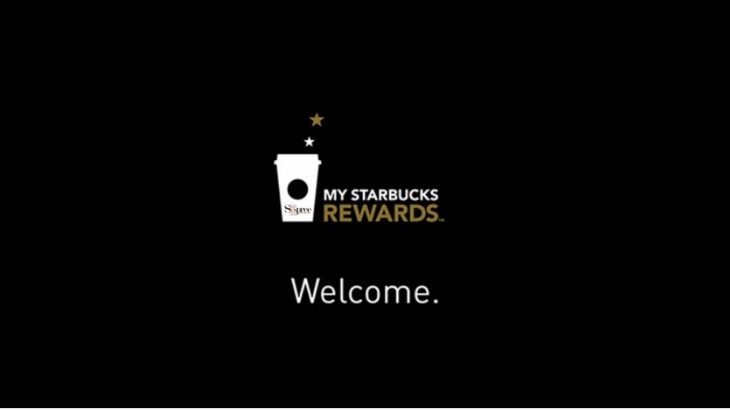
Gold foil, gold lettering, and many other variants are making their presence felt in various design elements and despite being a relative newcomer, they seem to be trending away to glory. With a neutral or black background, the gold lettering stands out magnificently as you can see when Starbucks launched its Star rewards program. The program evokes a feeling of luxury and oozes with sophistication, perfect for a premium brands’ premium reward program. It is quite elegant to look at seems like they are here to stay awhile.
2. Pastels:
Amongst the pastels that ruled the business world, Rose Quartz and Serenity topped the charts, as they created a buzz in fashion along with many other pastels making their presence felt in fashion. The world of web design is also following the watercolour trend actively and is exploding with some inspired watercolour designs. Pastels are here to stay, considering the watercolour trend backing it up quite well.
3. Mint Tones:

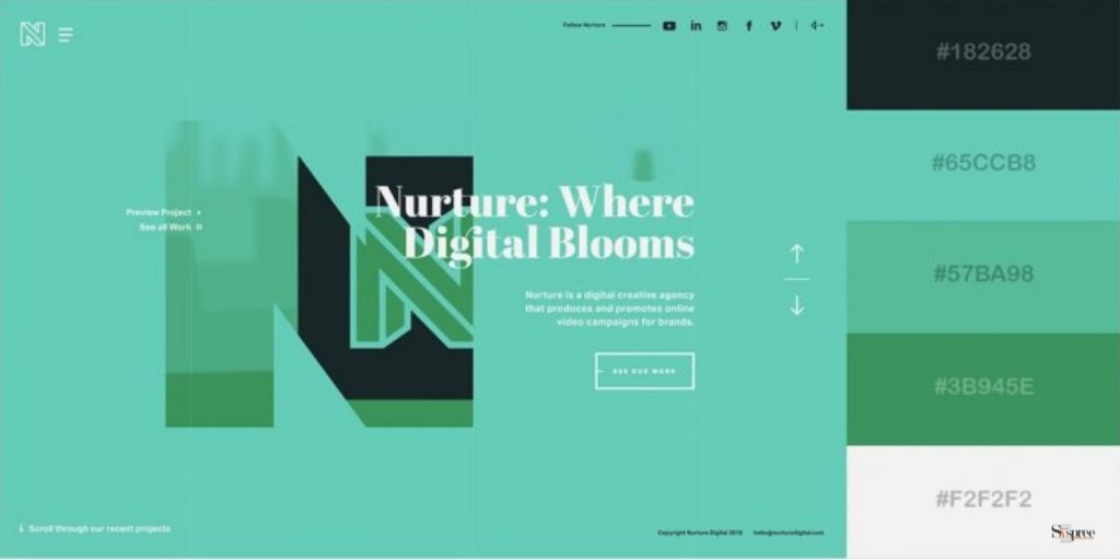
The mint tones give out a Fresh, futuristic, and high-tech vibe to your customers. It contains the hue that is reminiscent of the fragility of the environment, the warmth of spring that takes the chill off the cooler months and is also gender-neutral to boot.
4. Brights:
Bright colors are also hogging the stage and grabbing a large part of the limelight as brand logos have brightened a lot. Leading brands like Instagram have gone ahead with taking the neon scale higher and the difference is visible. It does not mean that these brands are trying to stand out of the crowd with palettes that sensationalize the design world but they have also tried to seek out social justice issues. It is also noticed those tech companies
love bright colors, be it branding, their office furniture, or the logos, so this trend surely seems to be on firm ground, ready to take off to the next level.
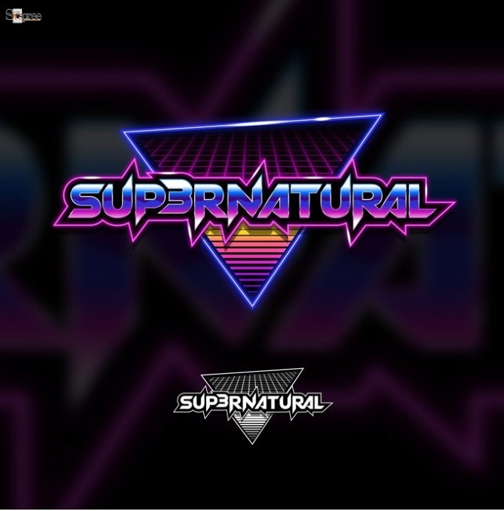
5. Luminescent Neons:

Stranger Things on Netflix has played a huge role in inspiring this throwback neon trend. We know that nothing quite catches the light like neon lettering and designs.
How does one select a color palette?
If you are planning to decide on your brand look, marketing materials, and web design, the color scheme becomes a vital criterion at this time, as any customized Web Development Company in Mumbai offering will tell you. Do not let the current trends dictate your choice, though you should browse through them to know what is preferred by others. You should choose a color scheme that will last forever when so-called trends have lived their life until the next trend appears.
According to any leading Web Development Company in Mumbai, this should be a good start for many of the users who have started researching how one can start their website. We assure you to go into further depth in our future blogs such as The Difference Between Web Development and Web Designing or The Importance of Using Split Screen Designs for Websites to learn about more exciting topics.


Good day! I just wish to give you a huge thumbs up for your great info you have got here on this post. I am returning to your blog for more soon.
Thank you for your kind words