In the previous blog, we got a brief idea of how the leading providers of web designing services in Mumbai, use Card formats to provide clarity and consolidation to their client’s website. We also focused on the different types of Card formats available. Read the Cards – Revolutionizing Web Design blog to get more details on the same. With the help of this blog, we will dive deep into the Material and Flat Design.
How to distinguish Material and Flat Design
Material design & Flat design can be distinguished from each other after considering the amount of skeuomorphism present in both of them, therefore it is first important to understand what skeuomorphism means. The term skeuomorphism is a design that has been created to emulate the physical world.
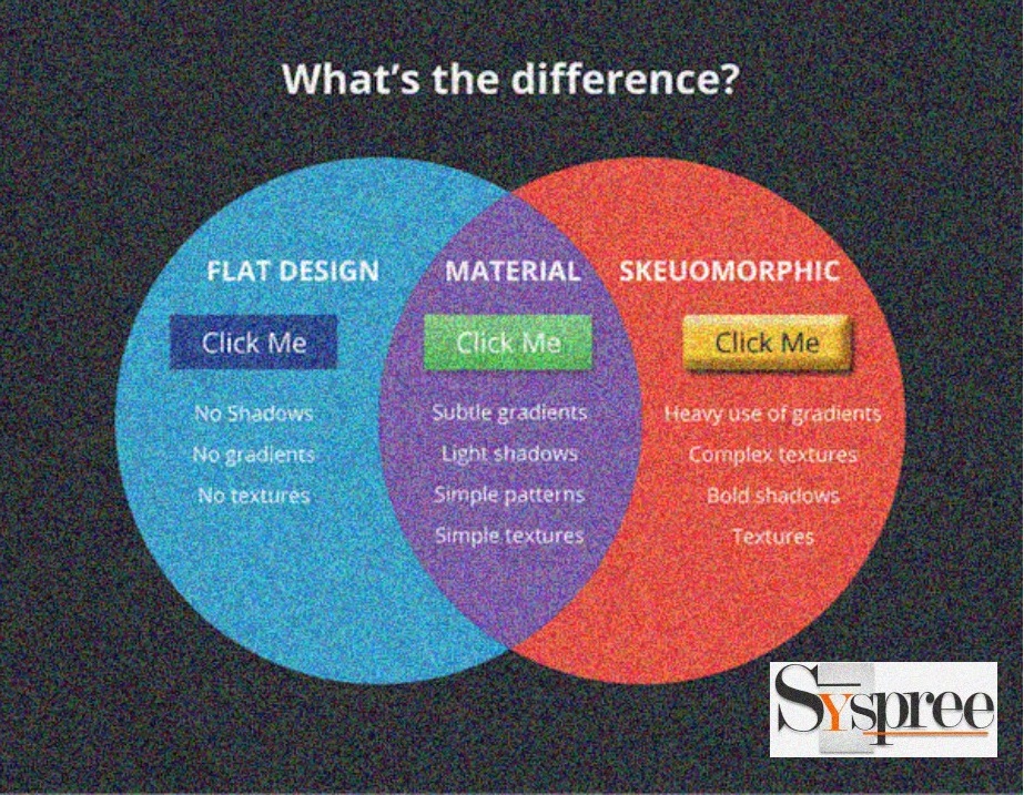
For example, synthesizer programs are made to resemble the keyboard and similar work is done with various other online tools. It has been a part of web design and interface design for quite a long time and is extensively used by web designers. Every leading web development company in Mumbai is aware of the use and individual strengths of both these designs and utilizes them as per need. The design fraternity decided to remove all the decorative elements and focus more on usability and user needs and a better emphasis on loading speed.
What is Flat Design?
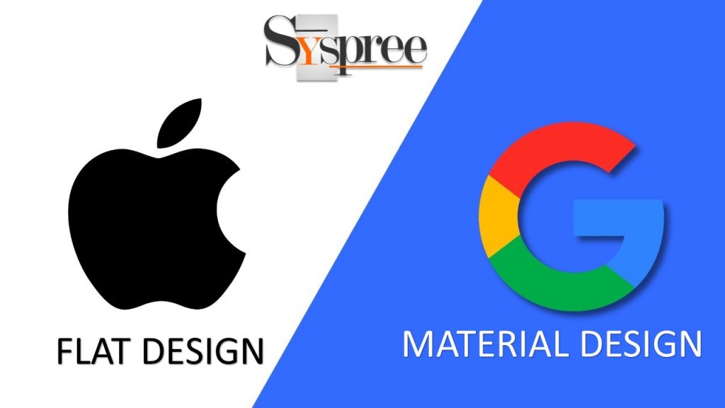
Flat design focuses on color, typography, and icons, while removing textures, gradients, drop shadows thus stripping the design of 3D effects. An example of the use of Flat design is Apple. It can be termed as an easy to understand design style that has been built for the exclusive use of digital media as it is incorporated with basic color themes, simple icons, and buttons.
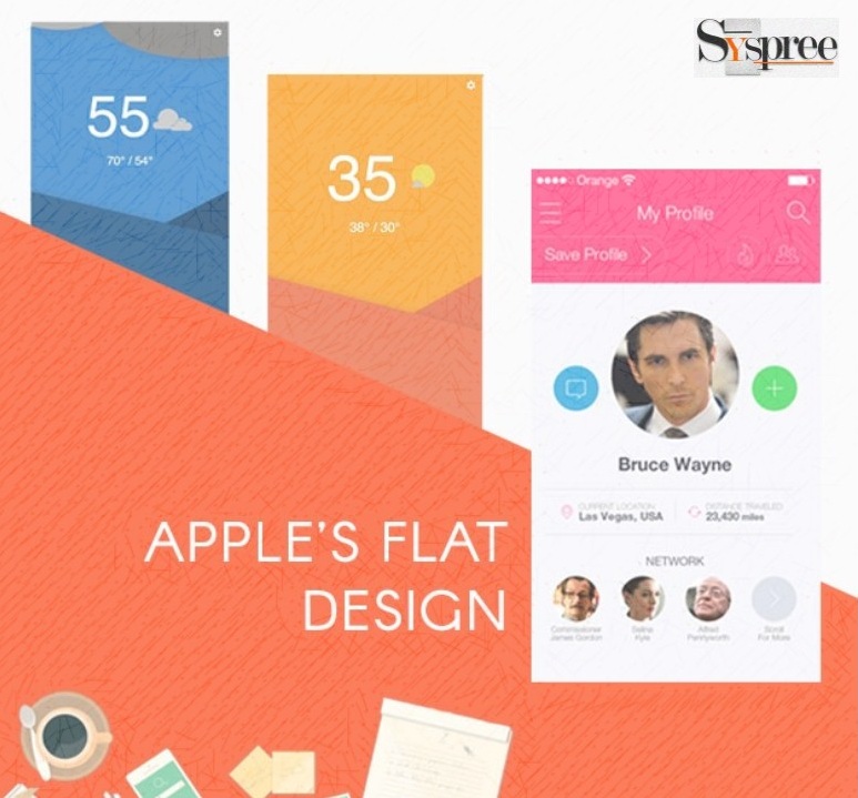
The emphasis on functionality makes flat design different from material design as appearance takes a back seat for a good reason. It helps designers to speed up loading times and looks good on any screen, immaterial of the resolution it offers which is one of the primary reasons for being preferred by any provider of web designing services in Mumbai.
Advantages:
- Distraction-free and Uncluttered design
- High Readability with clear typography
- Loads faster in both apps and browser
- Easily adjusted providing responsive design experience
Disadvantages:
- Elements look less clickable due to lack of depth
- Standing out as a creative design becomes difficult
- Does not have any design guidelines like other design systems
What is Material Design?
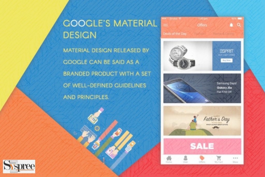
Material design, on the other hand, has a veritable range of unique features, the most prominent one being the Z-axis. An example of the use of Material design is Google. It is one form of flat design that has an added dash of skeuomorphism and resembles 2D planes hovering over each other at an elevated height. We are a leading digital marketing company in Mumbai and we bring together an appealing combination of features from both the designs while crafting world-class websites for our clients.
Advantages:
- Provides the user with a Simple and Unified Interface
- The Z-axis creates depth
- Intuitive to use
- Contains Principles and Goals that provide Consistency to designers
- Use of motion to show what is happening on the screen to the users
Disadvantages:
- A Floating action button can be superfluous
- These Designs are only valid for Android devices
- It is Heavily associated with Google which is why there is less room for branding
- UIs without motion lack intuitiveness
If you enjoyed reading the above blog and would like to indulge yourself into more such interesting reads related to Digital Marketing or would like to know more about the services of the leading providers of web designing services in Mumbai, Thane, and Navi-Mumbai feel free to check out our latest blogs on What is Digital Marketing? or The 4Ps of Digital Marketing.

