In Design, a clever little technique is known as “contrast.” It’s the secret sauce that makes things stand out! Think of it as a mix of light and dark, large and small, loud and soft, all coming together to make something truly special.
Understanding the Vital Role of Contrast in Design
Contrast in Design is the element that makes things pop and catch your eye. It’s like the difference between black and white or sweet and sour. When browsing a website or magazine, it directs your focus to the key elements, like a bold headline or a vibrant button begging for a click!
And it’s not only about colors and shapes. Words can also create contrast! For instance, when you come across a link amidst a sea of text, it acts as a small guiding light, whispering, “Hey, click here for more!” But here’s the truly fascinating aspect: contrast goes beyond mere aesthetics. It weaves a tale and establishes a connection. It’s like the hidden language of Design that speaks directly to your emotions.
The Fundamentals of Contrast
The leading graphic designing company in Mumbai say that the contrast in Design is like the secret seasoning in the creative realm – it brings out the flavor and adds an intriguing touch to everything. But what exactly is this enchanting element, and why does it hold such significance?
What is Contrast?
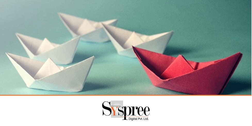
Contrast is about highlighting distinctions. It involves combining contrasting elements to generate visual interest and curiosity. Think of a black cat on a white background or a striking headline among a block of plain text – that’s contrast at work. However, contrast goes beyond just making things noticeable; it plays a crucial role in design clarity and communication. By accentuating differences, designers can direct the viewer’s focus, communicate hierarchy, and underscore key information.
Picture yourself creating a website. Your goal is to ensure that users immediately notice the crucial elements, such as the headline or call-to-action buttons. By incorporating contrast, whether through color, size, or typography, you can effectively highlight these components and ensure they are impossible to overlook.
But the contrast isn’t just limited to the digital world. They’re all around us, influencing how we see and feel things. Walking in nature, you’ll notice contrasting colors, textures, and shapes at every corner. Even in our daily lives, contrast makes things captivating and unforgettable.
The Significance of Contrast in Design
Let’s now explore the importance of contrast in Design. Contrast is not just about making things visually appealing; it’s a crucial principle that enhances effective communication. Whether you’re creating a poster, a logo, or a website, contrast plays a vital role in conveying your message clearly and boldly.
Imagine a movie poster. The interplay between light and dark, the striking typography, and the vibrant colors all collaborate to captivate your attention and set the mood of the film. Without contrast, the poster would lack excitement and be easily overlooked among countless others.
Leveraging Color Contrast
Color contrast is similar to an artist’s paintbrush, infusing each Design with richness and liveliness. The experts from the leading graphic designing company in Mumbai say its magical quality breathes life into visuals and captivates the viewer’s gaze. However, what is the secret behind its mechanics, and why does it hold such significance in Design?
Exploring the Color Wheel
Let’s start by exploring the concept of color contrast. Imagine a wheel divided into sections, each representing a different color. Now, picture two colors positioned on opposite sides of the wheel, such as blue and orange. These colors are known as high-contrast colors. Combined, they create a visually striking effect that is hard to miss. Think of a vibrant orange sunset against a deep blue sky – nature’s way of showcasing the power of color contrast.
On the other hand, we have low-contrast colors. These are colors that are located closer to each other on the color wheel, like yellow and orange. While they may not have the same impact as high-contrast colors, they still bring a sense of harmony and balance. Imagine a soft, pastel palette with hints of peach and lemon – it’s like a gentle whisper compared to the bold statement made by high contrast.
Implementing Effective Color Contrast in Web Design
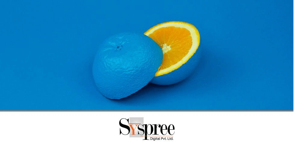
Let’s discuss the importance of effective color contrast in web design. Color is a key factor in guiding users through a website. Picture yourself searching for information on a site. The color of the navigation bar, buttons, and text all impact how quickly you can locate what you need. This is where color contrast becomes essential.
The leading web design company says by selecting colors with strong contrast for key elements such as buttons and links, designers can ensure they are easily noticeable on the page. This grabs the user’s attention and enhances usability and accessibility for everyone, including those with visual impairments.
Finding the perfect balance between contrasting colors is key. You don’t want to go overboard and overwhelm the senses, but you don’t want your designs to feel dull and uninspired. Knowing when to amp up the contrast is crucial for making a big impact.
Emphasizing the Importance of Size Contrast
Size is a crucial element in Design, and contrast in size makes designs stand out! Playing with scale effectively can draw the eye, establish importance, and bring a sense of excitement to any layout. So, why is size contrast such a big deal, and how can designers use it to make their work shine?
Importance of Size Contrast in Design
To begin with, let’s discuss the significance of size contrast in Design. Picture yourself strolling down a bustling street filled with buildings of different heights. What grabs your attention initially? Most likely, the towering skyscrapers stand out from the rest. This is because size contrast captures our focus and indicates importance. In Design, this principle holds as well. By adjusting the size of elements to their surroundings, designers can direct the viewer’s attention and highlight essential messages.
Practical Application: Making Elements Stand Out
Changing the size of elements can make a big difference in grabbing attention. For instance, on a website homepage, you want people to see the headline and call-to-action buttons first. You automatically make them stand out by making them bigger than everything else. It’s like highlighting the key parts of your Design and saying, “Hey, check this out!”
Size contrast is not only about making things big just because it’s about establishing a visual hierarchy and leading the viewer through the design. Imagine it as a map with different landmarks of varying heights—the tallest buildings catch your attention as focal points, while the smaller ones blend into the background. In design, size plays a similar role, aiding users in navigating and comprehending the content effortlessly.
So, what are some practical ways for designers to use size contrast? The experts from the leading web design company answer that one way is to experiment with different scales to achieve emphasis and balance. For example, combining a big headline with smaller supporting text can make it stand out and create a clear hierarchy. Likewise, oversized images or icons can bring visual appeal and make a layout more varied.
Highlighting with Shape Contrast
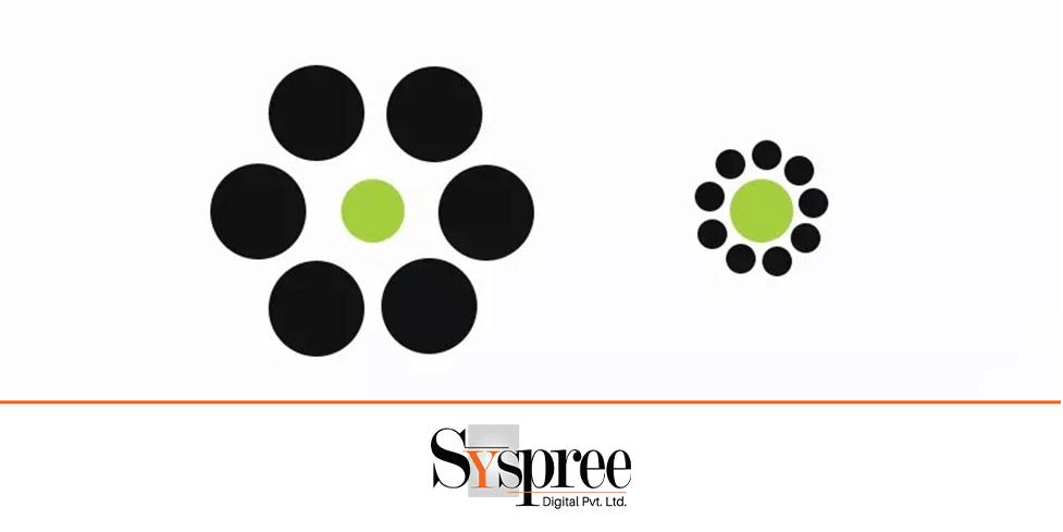
Shape contrast plays a crucial role in Design, acting as a silent superhero that directs the viewer’s gaze and brings dimension to any composition. The harmonious blend of circles, squares, and triangles creates a visual impact that captures attention and leaves a lasting impression. But what makes shape contrast essential in Design, and how does it work?
Utilizing Shapes for Visual Emphasis
Let’s delve into its role in visual emphasis to grasp the significance of shape contrast. Picture yourself staring at a blank canvas. Now, envision a single circle in the middle. What catches your eye? The contrast between the circular shape and the emptiness of the canvas forms a focal point—an eye-catching element that demands attention.
However, shape contrast goes beyond establishing focal points; it also contributes to adding visual appeal and intricacy to a design. Consider a webpage with a grid layout. By incorporating a variety of shapes—such as squares, rectangles, and circles—designers can break the uniformity and craft a lively, captivating experience for the viewer.
Strategies for Introducing Shape Contrast in Design
So, what are some ways that designers can utilize the power of shape contrast in their work? One technique is to play around with various shapes to achieve a visual balance and tension. For instance, combining organic, flowing shapes with rigid, geometric ones can create a pleasing harmony and contrast. Additionally, incorporating unexpected shapes, such as a triangle amidst a sea of squares, can add an element of surprise and intrigue to a design.
Another approach is to use shapes to reinforce hierarchy and structure. Let’s say you’re designing a poster with different sections of text. By using different shapes, like circles for headlines and squares for body text, designers can establish a clear visual hierarchy that guides the viewer’s attention and emphasizes the importance of each section.
Typography as a Tool for Contrast
Typography goes beyond simply selecting fonts; it involves crafting a harmonious blend of shapes and styles that move gracefully across the page, drawing the eye and communicating messages. Within the realm of design, typography acts as a valuable instrument for creating contrast, enabling designers to improve legibility, define structure, and enhance visual attractiveness.
Strategic Font Pairing
The leading creative agency in Mumbai says strategic font pairing is a crucial element in utilizing typography for contrast. Similar to the perfect peanut butter and jelly combination, certain fonts are meant to be used together, while others clash like oil and water. When designers pair complementary fonts, like a sleek sans-serif with a classic serif, they can achieve visual harmony that improves readability and adds dimension to the Design. Additionally, contrasting fonts can establish a hierarchy, with bold headlines capturing attention and lighter, more subtle body text guiding readers through the content.
Exploring Typography Styles and Their Role in Contrast
But font pairing is just the start. Exploring different typography styles opens up a new world of possibilities for creating contrast. Each style brings unique flavor to the design table, from elegant scripts to bold slab serifs. For instance, combining a delicate script with a sturdy sans-serif font creates a striking, classy and contemporary contrast. Similarly, mixing serif and sans-serif fonts with different weights and styles adds visual interest and complexity to the Design, keeping the reader captivated and curious.
Furthermore, typography styles play a vital role in establishing the overall tone and mood of the design. A playful and whimsical font can evoke a sense of light-heartedness and fun, while a sleek and minimalist font exudes sophistication and professionalism. By carefully selecting typography styles that align with the intended message and target audience, designers can create designs that resonate on a deeper level and leave a lasting impression.
Utilizing Various Font Attributes for Hierarchy
Creating a visual hierarchy is similar to leading a choir of words – arranging different components to form a balanced layout that directs the reader’s gaze and conveys a message. Typography involves utilizing different font characteristics to establish contrast and importance.
Size, Weight, Form
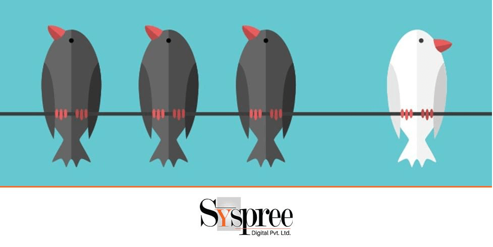
The visual hierarchy in Design is orchestrated by size, weight, and form, each playing a unique role. Size is the most noticeable factor, as larger text naturally grabs more attention than smaller text. Designers can manipulate font sizes to establish a clear hierarchy that directs the viewer’s focus and emphasizes key messages.
On the other hand, weight refers to the thickness or boldness of a font. Bold text stands out in contrast to regular or light text, making it ideal for headlines, subheadings, or other significant elements. Designers can introduce depth and dimension by incorporating varying font weights throughout a design, resulting in a balanced and engaging composition.
The experts from the leading creative agency in Mumbai say the form of a font includes its shape, style, details like serif or sans-serif, spacing, and curvature. Serif fonts give a traditional and elegant feel, while sans-serif fonts offer a sleek and contemporary look. Mixing different font forms can bring visual appeal and variety to a design.
Application of Font Attributes in Design Composition
Using font attributes in Design is all about finding the right balance and purpose. Headlines are big and bold to catch the eye, while body text stays small and light for easy reading. Adding a touch of italics or underlining can help highlight key details without removing the overall look.
Conclusion
Differences play a key role in Design, combining various elements to engage and convey messages. Whether through bold colors or diverse fonts, contrast directs attention, narrates tales, and stirs feelings. Let contrast lead the way in your creative journey. If you like this blog check out our previous blog 16th Week Roundup: Meta Set to Launch Ads on Threads, GSC Updates, Airchat, and More!



Thanks for sharing this! I found your information really helpful. Your explanations were easy to follow, and I appreciated how you explain about the contrast in design is essential to make it look attractive, it was very informative and useful. Keep the posts coming! Very good talent.
Hi there, This article helps to design with contrast who are actively on the Design part. I know Design is more important for generating leads and actions on websites. But I don’t know if “Contrast” is important for Giving attractive looks to improve website visibility. Thank you For Giving this information as per article.
But we have improved the design with contrast, if there is any chance of getting actions and leads through on the websites