Syspree

What's your thought?


Enhance Every Customer Interaction: The Future of Engagement

Transform Experiences with Our Cutting-Edge Responsive UX Solutions

Transform Experiences with Our Cutting-Edge Responsive UX Solutions

Discover how we can revolutionize your user interface. Schedule a consultation today!

Trusted by Industry Leaders Across the Globe

Enhancing Experiences, Expanding Horizons

Are Your Digital Touchpoints Holding You Back?

In a fast-paced digital world, a seamless user experience is pivotal for business success. Yet, many enterprises struggle with outdated interfaces, leading to frustrated users and missed opportunities. Without Responsive UX Solutions, businesses often face high bounce rates, low engagement, and a tarnished brand image. The need for an effective user experience is no longer optional; it’s a mission-critical requirement. Empower your brand by creating an immersive digital experience that captivates and converts.

Overcome Your UX Challenges

Complex Navigation

Simplify the user journey for intuitive interaction.

Outdated Design

Refresh your visuals to reflect modern aesthetics.

Low Engagement

Enhance interaction with dynamic, appealing interfaces.

Poor Accessibility

Ensure your platform is accessible to all users.

Elevate Your Brand Presence Through Transformative Design

Empower Your Business with Syspree’s UX Expertise

At SySpree, our Responsive UX Solutions are crafted using the CORE Framework—Consult, Optimize, Reinforce, Excel. We begin by consulting with your team to understand your unique needs. We then optimize your digital interface, reinforcing the user journey with state-of-the-art solutions. Finally, we excel by ensuring your users enjoy a seamless, interactive experience tailored to your business goals.

Consult

Dive deep to tailor user experiences.

Optimize

Enhance interfaces for optimal engagement.

Reinforce

Use cutting-edge technology for lasting results.

Excel

Deliver unparalleled user satisfaction.

Consult

Dive deep to tailor user experiences.

Optimize

Enhance interfaces for optimal engagement.

Reinforce

Use cutting-edge technology for lasting results.

Excel

Deliver unparalleled user satisfaction.

Optimize

Enhance interfaces for optimal engagement.

Consult

Dive deep to tailor user experiences.

Reinforce

Use cutting-edge technology for lasting results.

Excel

Deliver unparalleled user satisfaction.

Testimonials

What Our Clients Achieved with Us

Our Capabilities

Comprehensive UX Solutions Tailored for You

Dynamic User Interface Design

Craft interfaces that captivate.

Interactive Digital Experience

Engage users with immersive experiences.

Customer Journey Mapping

Build pathways that lead to conversions.

Mobile-First UX Optimization

Ensure fluid mobile interactions.

Advanced User Testing

Refine solutions based on real feedback.

Transformative Results, Measurable Growth

Success Stories That Inspire Confidence

Witness how we reduced bounce rates by 40% through our innovative UX strategies. Discover more by visiting our detailed case studies.

CASE STUDIES

30 Times Surge in Leads within a year

Sports Coaching Company

CASE STUDIES

Astounding 800% Increase in FMCG Distributor’s Web Traffic in Just 13 Months!

FMCG Distributors

CASE STUDIES

500% Traffic boost in only 6 months

DECKING AND PATIO COMPANY

CASE STUDIES

Improve Your Traffic by 1400% In Just 2 months!

Immigration Company

CASE STUDIES

900% Traffic Surge in Just 1.5 Years

Holistic Lifestyle
e-commerce

CASE STUDIES

Double Leads for Accounting company in just 2 months

Accountants and corporate services

Tailored Solutions for Every Sector

Diverse Industry Expertise

E-Commerce

Revolutionize how customers shop online.

Technology and SaaS

Enhance platform intuitiveness and efficiency.

Consulting and Corporate Services

Deliver seamless professional interfaces.

Education and Training

Enrich interactive learning experiences.

Healthcare

Simplify patient interactions and engagement.

Interior Designers and Renovators

Visualize client dreams through UX.

Travel and Tourism

Create journeys before the journey begins.

Hospitality and FnB

Design memorable dining and stay experiences.

Our Global Presence

Countries We are Present In

Data-Driven Impact to Elevate Your Projects

Proven Success in Numbers

Keywords Ranked on Page 1
0 +
5X Business Growth
0 +
5X Business Growth
0 +
Websites Managed
0 +
Leads per day
0 +

OUR LEADERSHIP

With SySpree’s leadership, excellence in Responsive UX Solutions is a standard we uphold in every project

OUR TEAM

Our dedicated team brings creativity and precision to deliver outstanding User Experience Design.

CASE STUDIES

Proven Results Across Industries

Explore how Syspree has helped businesses across industries achieve  measurable growth with tailored digital marketing and web development strategies. From e-commerce to tech startups, our custom solutions deliver proven results that drive revenue, improve customer acquisition, and enhance brand visibility

CASE STUDIES

30 Times Surge in Leads within a year

Sports Coaching Company

CASE STUDIES

Astounding 800% Increase in FMCG Distributor’s Web Traffic in Just 13 Months!

FMCG Distributors

Decking case study for digital Marketing for 500% increase in leads

CASE STUDIES

500% Traffic boost in only 6 months

DECKING AND PATIO COMPANY

CASE STUDIES

Improve Your Traffic by 1400% In Just 2 months!

Immigration Company

CASE STUDIES

900% Traffic Surge in Just 1.5 Years

Holistic Lifestyle
e-commerce

double leads in less than 2 months for accounting companies, case study for digital Marketing for 200% increase in traffic syspree

CASE STUDIES

Double Leads for Accounting company in just 2 months

Accountants and corporate services

OUR EXPERTISE, YOUR KNOWLEDGE

Blogs, Podcasts,Vlogs

How Improved UX Can Lead to Business Success in 2025

Exploring Interactive Design Trends in 2025

We spread the KNOWLEDGE

Blogs, Podcasts,Vlogs

  • All Posts
  • Blogs
  • Branding and Marketing Services blog
  • Content Marketing
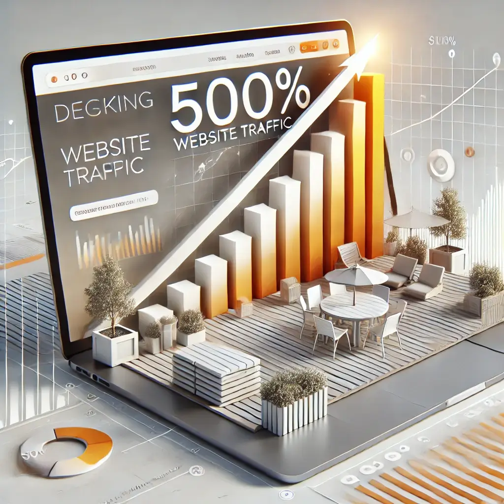
  • Decking Business Digital Marketing
  • Graphic designing
  • Guides
  • Job Post
  • Logo Designing services blog
  • Marketing and Sales
  • Others
  • Paid advertising
  • Podcasts
  • Roundup
  • SEO
  • Social Media Marketing
  • social media marketing
  • SySpree
  • Uncategorized
  • Vlogs
  • Web Design
  • Web Develipment

Let’s Make Your Vision a Reality

Contact us today to schedule a consultation. Discover how Syspree can transform your digital presence and help your business thrive.

FAQ

Your Responsive UX Solutions Questions Answered​

1. How does a responsive UX improve user engagement and conversion rates?

In the fast-evolving digital landscape of 2025, delivering a seamless and engaging user experience (UX) is not just an option—it’s a necessity for businesses looking to thrive online. This is where the power of a responsive UX solution comes into play. Responsive UX design is more than just making your website look good; it’s about creating an interactive and intuitive experience that resonates with users, keeps them engaged, and ultimately drives conversions. Let’s delve into how a responsive UX can revolutionize your business’s online presence.

The Foundation of User Engagement

At the heart of responsive UX solutions lies the fundamental aim of enhancing user interaction. A responsive UX caters to the needs of users by making your digital platform easy to navigate and delightful to use on any device, be it a smartphone, tablet, or desktop. When a website is responsive, it automatically adjusts its layout to provide the optimal viewing experience. This adaptability is crucial, considering the variety of devices and screen sizes your audience may use.

Imagine a potential client visiting your site. If they encounter long loading times, difficult navigation, or elements that don’t fit their screen, they are likely to leave and never return. With responsive UX design, you ensure that every user—regardless of how they access your site—encounters a seamless and frustration-free journey. This level of user-centric design naturally improves user engagement as it encourages visitors to spend more time on your site, exploring your offerings without barriers.

Enhancing Conversion Rates Through Usability

Now, let’s discuss how improved user engagement directly correlates to higher conversion rates. A responsive UX design improves usability significantly, which is essential for converting casual visitors into loyal customers. By focusing on intuitive navigation, clear calls-to-action (CTAs), and streamlined checkout processes, responsive UX design simplifies user journeys. When users find what they need effortlessly, they are more likely to take desired actions, such as signing up for newsletters, downloading content, or making a purchase.

Furthermore, responsive UX solutions enhance trust and credibility. A professionally designed website signals to potential customers that your business is reliable and up-to-date. When users encounter a smooth and satisfying browsing experience, it fosters a sense of confidence in your brand, making them more inclined to establish a lasting relationship with your company.

SEO Advantages of Responsive UX Design

Responsive UX design offers significant advantages when it comes to search engine optimization (SEO). In 2025, search engines prioritize mobile-friendly, user-centered websites in their rankings. This makes responsive design not only a user-experience preference but also an SEO strategy. When your site is optimized for responsiveness, it loads faster, scales properly on different devices, and reduces bounce rates—all factors that contribute to higher search rankings.

With higher visibility in search engine results, your site attracts more organic traffic, giving you the opportunity to convert more visitors into customers. This synergy between responsive UX and SEO underlines why investing in responsive design is not just beneficial but essential for your business growth online.

Building Long-Term Relationships

In today’s competitive market, building long-term relationships with customers is more important than ever. A responsive UX design not only captures the attention of new users but also retains existing ones by nurturing an ongoing, positive user experience. By delivering consistent quality and reliability across all touchpoints, businesses can foster customer loyalty and drive repeat business.

A good example of this is a personalized user experience that anticipates user needs. Through responsive UX design, it’s possible to integrate personalized recommendations and tailored content based on past interactions and preferences. This personalized approach not only engages users more deeply but also prompts action by showing them relevant products or services they are more likely to be interested in.

Competitive Edge and Innovation

Utilizing the latest in responsive UX solutions can also position your business as a leader and innovator in your industry. By staying ahead of UX trends and implementing cutting-edge technologies such as voice-activated interfaces or augmented reality (AR), you can differentiate your brand from competitors and create unique, memorable experiences for your users.

Investing in responsive UX solutions positions your business at the forefront of digital innovation. In an era where user experience is paramount, companies that prioritize responsive UX design are more likely to gain and maintain a competitive edge, attracting discerning customers who value quality interactions.

Final Thoughts

Responsive UX design is the key to unlocking user engagement and boosting conversion rates in 2025 and beyond. By ensuring your website is adaptable, user-friendly, and visually appealing across all devices, you are not only meeting consumer expectations but also setting a standard for excellence. The return on investment in responsive UX solutions is substantial, translating into higher user satisfaction, increased loyalty, and improved bottom-line results.

At SySpree, we understand the transformative power of a responsive UX design in nurturing digital success. Our team of experts is dedicated to crafting bespoke UX solutions that align with your business goals and resonate with your audience. Embrace the future of digital engagement and let us help you revolutionize your customer experience for sustainable growth and prosperity.

In the competitive world of 2025, businesses cannot afford to overlook the imperative of responsive UX solutions. It is more than a design choice—it is a strategic business decision that will propel your brand towards unmatched user engagement and conversion success. Make the choice to prioritize user experience today, and watch as your business soars to new heights in the digital realm.

2. How do prototyping services support user testing during the design phase?

In the dynamic digital landscape of 2025, businesses of all sizes are recognizing the crucial importance of creating web experiences that cater to diverse audiences. Enter the concept of responsive UX solutions—a pivotal approach that marries user experience with the need for accessibility and inclusivity. With an increasing emphasis on digital equity, modern web design is undergoing a transformation to be more inclusive and accessible, ensuring that every user, regardless of their abilities or circumstances, can navigate and appreciate web content with ease.

What is Responsive UX and Why It Matters?

Responsive UX, or responsive user experience, is more than just making websites mobile-friendly. It is about crafting intuitive, adaptable, and fluid interfaces that dynamically adjust to fit the screen size and capabilities of any device being used. In today’s digital-first world, responsive UX is not just a design trend; it is a necessity that enhances the overall user journey, ensuring seamless interaction across a myriad of platforms—be it smartphones, tablets, desktops, or even emerging tech like wearables.

Prioritizing Accessibility and Inclusivity in Web Design

At the heart of responsive UX solutions lies a commitment to accessibility and inclusivity. This dual focus is increasingly significant as businesses strive to reach broader audiences while adhering to global standards and regulations. Here’s how responsive UX addresses these critical aspects:

  1. Accessibility-first Approach: Accessibility in web design is about removing barriers that prevent interaction with, or access to, websites by individuals with disabilities. Responsive UX solutions incorporate accessibility standards, such as the Web Content Accessibility Guidelines (WCAG), to ensure that all users, including those with visual, auditory, or motor impairments, can effortlessly navigate and understand web content. This includes functionalities like text-to-speech, voice navigation, screen reader compatibility, and keyboard-navigable websites.
  2. Designing for Inclusivity: Inclusivity goes hand-in-hand with accessibility but takes a broader perspective by considering the diverse needs, cultural backgrounds, and abilities of all users. Inclusive design ensures everyone, regardless of their circumstances, can engage with the digital content independently. This could mean providing multilingual support, customizable user interfaces, or designing content that is culturally and contextually relevant to a global audience.
  3. User-centric Design Principles: A responsive UX design is inherently user-centric, focusing on creating experiences that are understandable, navigable, and enjoyable for all. By leveraging user feedback and analytics, designs are crafted to meet users’ needs, expectations, and preferences, thus improving engagement and satisfaction.
  4. Scalable and Flexible Solutions: As technology evolves, so do user expectations. Responsive UX solutions are built to be inherently flexible and scalable, ensuring that websites remain accessible and inclusive as new technologies and devices emerge. This forward-thinking approach facilitates enduring user engagements and adaptability, fostering brand loyalty.
  5. Enhanced User Interactions: By adopting responsive UX practices, businesses can optimize user interactions through intuitive navigation, faster loading times, and visually appealing layouts. Improved visual hierarchy, adequate color contrast, and resizable text help in creating interfaces that are easy to interact with and suitable for users with visual impairments.

Responsive UX Solutions Company: Trailblazers in Accessibility and Inclusivity

SySpree’s Responsive UX Solutions Company is a frontrunner in crafting digital experiences that prioritize accessibility and inclusivity. Our commitment to this transformative approach sets us apart, focusing on delivering solutions that are not only responsive but also resonate with every user’s unique needs. Through continuous innovation, industry expertise, and ethical design practices, we aim to empower businesses with future-proof UX strategies that enhance connectivity and accessibility.

  1. Innovative UX Design Practices: We embrace cutting-edge tools and methodologies that propel accessibility to the forefront of digital design. From conducting comprehensive accessibility audits to implementing assistive technologies, our strategies are driven by a deep understanding of diverse user needs.
  2. Thought Leadership and Guidance: As thought leaders in UX design, we educate and guide businesses on the significance of inclusive digital environments. Through workshops, webinars, and insightful publications, we foster knowledge-sharing that translates vision into actionable strategies.
  3. Bespoke Solutions Tailored to Your Needs: Our team believes in crafting tailored UX solutions that cater to the unique challenges and opportunities faced by businesses. By aligning your goals with best practice accessibility guidelines, we deliver bespoke solutions that drive inclusivity and enhance user experiences.

Why Choose SySpree for Responsive UX Solutions?

Driving accessibility and inclusivity through responsive UX is more than a service—it’s a core philosophy at SySpree. Partnering with us means aligning with a company that prioritizes human-centered design, user empowerment, and digital equity. Here’s why you should choose us:

  1. Proven Track Record: Our portfolio is a testament to successful projects that have transformed businesses by improving web accessibility and enhancing user engagement across the globe.
  2. Expert Team: Our team of UX designers, developers, and strategists are passionate about pushing the boundaries of traditional design to embrace modern practices that focus on accessibility and inclusion.
  3. Commitment to Quality: We are dedicated to delivering high-quality, responsive UX solutions that embody integrity, innovation, and inclusivity, all while keeping your business objectives at the forefront.

In conclusion, responsive UX solutions not only fulfill the technical requirements of diverse devices but also transcend into a broader commitment to accessibility and inclusivity. By embracing these principles, your business can not only meet regulatory standards but also open doors to a wider audience, thereby enhancing engagement, loyalty, and impact. With SySpree’s expertise, businesses are empowered to build meaningful digital experiences that are inclusive of all users, ultimately creating a world where accessibility is the norm rather than an afterthought. Together, let’s champion a future where digital content is universally accessible and inclusively designed.

3. How does responsive UX design enhance website performance and SEO rankings?

In an increasingly digital world, where online interactions form the backbone of business success, the significance of responsive UX (user experience) design in enhancing website performance and SEO rankings cannot be overstated. At SySpree, we are dedicated to helping businesses achieve digital success through cutting-edge responsive UX solutions. This article explores how responsive UX design not only boosts website performance but also significantly improves SEO rankings, fostering a seamless user experience and driving business growth.

Understanding Responsive UX Design

Before diving into its advantages, let’s understand what responsive UX design entails. Simply put, responsive UX design ensures that a website adapts gracefully to the screen sizes and orientations of different devices. Whether a user accesses a site via a desktop, laptop, tablet, or smartphone, a responsive UX design provides an optimal viewing and interaction experience. This adaptability is crucial in today’s mobile-driven world, where users expect ease of access and seamless navigation across devices.

Enhancing Website Performance with Responsive UX Design

1. Improved Loading Speed: One of the most critical factors influencing website performance is loading speed. Websites with responsive UX design are equipped with fluid grids, flexible images, and media queries that ensure quick and efficient loading times. Faster loading speeds not only enhance user satisfaction but also decrease bounce rates. By employing responsive design techniques, your website becomes lightweight and agile, offering visitors a smooth and engaging browsing experience, regardless of the device they use.

2. Consistent User Experience: Responsive UX design provides consistency in how your content is presented across different platforms. This consistency deepens user engagement, as there’s no need for them to relearn navigation or search for crucial information when switching devices. A consistent and intuitive user experience fosters trust and encourages users to spend more time on your site, exploring your offerings without friction.

3. Enhanced Accessibility and Reach: Making your website accessible to a broader audience is essential in today’s competitive market. Responsive UX design accommodates users with varying needs and preferences, including those relying on assistive devices. By broadening your website’s accessibility, you not only serve a wider demographic but also adhere to international accessibility standards, enhancing your brand’s reputation and reach.

Boosting SEO Rankings through Responsive UX Design

1. Google’s Mobile-First Indexing: In 2025, Google’s algorithm continues to prioritize mobile-first indexing. This means Google primarily evaluates your site based on its mobile version when determining rankings. A responsive UX design ensures your website is mobile-friendly, positioning it favorably in search results. By aligning with Google’s preferences, your site is more likely to appear at the top of search engine results pages (SERPs), driving organic traffic growth.

2. Reduced Bounce Rates: Bounce rate is a critical factor that search engines consider when ranking websites. High bounce rates suggest a negative user experience, prompting search engines to penalize the website with lower rankings. Responsive UX design, by offering streamlined navigation and engaging interfaces, reduces the likelihood of bounces. Visitors remain engaged, interacting with content and exploring various pages, which signals to search engines that your site is valuable and relevant.

3. Seamless Integration of SEO Best Practices: Responsive UX design incorporates essential SEO best practices intrinsically. By ensuring optimal performance across devices, enhancing page speed, and creating a unified URL structure, responsive design facilitates easier indexing and crawling by search engines. Additionally, with an adaptable design that prioritizes user satisfaction, you can focus on creating quality, keyword-rich content that resonates with both audiences and search engines.

Commitment to Innovation and Expertise

At SySpree, our commitment to innovation and expertise in responsive UX solutions sets us apart as industry leaders. We understand the ever-evolving nature of digital landscapes and the nuances of designing user-centered experiences. Our experts specialize in crafting tailored responsive UX strategies that align with your business goals, helping you stay ahead in a competitive marketplace.

Conclusion

In the digital realm of 2025, responsive UX design is no longer an option but a necessity for businesses aiming to excel online. By enhancing website performance and boosting SEO rankings, responsive UX design empowers businesses to connect with their audience meaningfully and effectively. At SySpree, we are passionate about delivering transformative responsive UX solutions that drive results, helping your business thrive in today’s digital ecosystem. Partner with SySpree, and unlock the full potential of your digital presence—where exceptional design meets unparalleled functionality.

4. What are the best practices in creating responsive UX for mobile and tablet users?

Creating responsive UX for mobile and tablet users is an essential strategy for any business aiming to thrive in today’s digitally driven market. As an industry leader in Responsive UX Solutions, SySpree understands the importance of delivering intuitive, seamless experiences across all devices. Here, we outline best practices that are foundational to crafting exceptional responsive user interfaces, ensuring your brand engages users and converts interactions into meaningful business outcomes.

Understanding Responsive UX Design

Responsive UX design refers to creating web applications that dynamically adjust to different screen sizes and orientations, offering an optimal user experience regardless of the device in use. A well-executed responsive design not only enhances aesthetics but also boosts functionality and accessibility, which is vital for customer retention and satisfaction.

Key Best Practices for Responsive UX Design:

1. Embrace Mobile-First Approach

Start designing for the smallest screen first and then scale up. This method forces designers to prioritize essential elements and create a clean, focused interface that enhances usability on mobile devices. Once the mobile version is perfected, it’s easier to add complexity as needed for larger screens. This approach is widely recognized for improving overall site performance and delivering a more cohesive user experience.

2. Employ Flexible Grid Layouts

Flexibility is at the heart of responsive design. Implementing a flexible grid system allows your web content to resize and rearrange itself depending on the device’s screen size. By using relative units like percentages rather than fixed widths, the layout can naturally adjust, providing a seamless user journey across different device types, whether a smartphone or a tablet.

3. Optimize Touch Targets

On mobile and tablet devices, users interact with content through touch, making it essential that tap targets are appropriately sized and spaced. Ensure that buttons, links, and any interactive elements are large enough to be easily tapped without causing frustration. This increases the ease of navigation, improving the overall user experience and reducing bounce rates.

4. Utilize Responsive Media

Images and media play a critical role in user interaction. Use CSS techniques like media queries to load different image sizes based on the screen’s resolution. This practice not only enhances loading times but also ensures images are displayed proportionately, enriching the visual appeal without sacrificing performance.

5. Prioritize Speed and Performance

Page speed greatly affects user retention and satisfaction. Implement lazy loading for images and resources, compress files, and leverage browser caching to enhance loading times. A fast-performing site often leads to better search engine rankings and higher conversion rates, directly impacting your bottom line.

6. Enhance Readability and Navigation

Text readability is a significant factor on smaller screens. Utilize larger fonts for mobile and ensure there is adequate line spacing to avoid visual clutter. A simplified, easily navigable menu aids users in finding necessary information without hassle, thus improving the overall user experience.

7. Test Across Devices and Browsers

Continuous testing across various devices and browsers is essential to support a flawless user experience. Tools like BrowserStack or responsive design testing software can help identify any inconsistencies, allowing for quick iteration and refinement of your responsive design strategies.

Responsive Design: A Competitive Edge

Implementing these best practices can significantly refine your mobile and tablet presence, propelling your business ahead in the competitive landscape. SySpree’s Responsive UX Solutions are meticulously tailored to each client’s unique needs, driving engagement through strategic design techniques. Our expertise ensures your brand’s digital touchpoints deliver exceptional, consistent experiences that resonate with users leading to greater brand loyalty and business growth.

Thought Leadership in Responsive UX

At SySpree, we’re not just implementing current best practices; we’re continually exploring innovative design methodologies. We’re thought leaders in responsive design, meaning we’re always looking at the future, ready to leverage emerging technologies and trends that enhance responsiveness and user experience.

Our deep insights into behavioral patterns assist us in predicting user needs, which allows us to design interfaces that are not only responsive but also intuitive. We ensure that every project is imbued with our hallmark creativity and technical proficiency, establishing us as thought leaders in the responsive UX solutions field.

Value Beyond Design

Our personalized approach ensures that UX solutions align with your overall brand strategy and business objectives. We understand the importance of harmonizing design aesthetics with functionality, creating a symbiotic relationship where each element serves a purpose and contributes to a delightful user experience.

Conclusion

In 2025 and beyond, businesses that prioritize responsive UX design will undoubtedly stand out. By implementing these best practices, your brand will connect more profoundly with its audience, providing a seamless digital journey that turns every interaction into an opportunity for engagement and conversion.

With SySpree’s expertise in Responsive UX Solutions, we empower your business to transform its digital presence, ensuring every user interaction is meaningful and impactful. Choose SySpree for a tailored, future-focused approach to responsive UX design that not only meets today’s standards but sets tomorrow’s benchmarks. Let us partner with you to stay ahead in the fast-evolving digital landscape, driving success through innovative, responsive design solutions.

As we journey into the landscape of 2025, the digital realm continues its rapid evolution, demanding that businesses stay ahead of user experience (UX) trends. For enterprises looking to excel in this competitive environment, understanding the future trends in responsive UX solutions is critical. At Responsive UX Solutions Company, we are at the forefront of innovation, constantly shaping and redefining how businesses engage with their audience. Let’s explore the dynamic trends that are set to influence the future of responsive UX solutions for enterprises.

1. Artificial Intelligence and Machine Learning

Artificial Intelligence (AI) and Machine Learning (ML) are not just buzzwords anymore; they are pivotal components of responsive UX solutions. In 2025, AI-powered UX solutions will become even more intuitive, offering personalized experiences based on user behavior analytics. ML algorithms can analyze user interactions in real time, providing insights that guide the creation of more user-centric designs.

By incorporating AI, Responsive UX Solutions Company helps clients anticipate user needs, ensuring that interfaces are not just reactive but proactive. This anticipatory design reduces user friction and enhances engagement, positioning your enterprise as a leader in customer satisfaction.

2. Voice User Interface (VUI) and Conversational UX

The rise of voice-activated technologies is shaping the future of UX design. More than half of all interactions are predicted to be voice-driven by 2025, making Voice User Interfaces (VUIs) an essential aspect of responsive UX solutions. Enterprises must optimize their platforms for voice interaction, creating seamless conversational experiences.

At Responsive UX Solutions Company, we embrace the shift to conversational UX by designing interfaces that can effectively handle natural language processing. Our solutions are not only designed to understand and respond to voice commands but also enhance accessibility, catering to a broader audience, including those with disabilities.

3. Augmented Reality (AR) and Virtual Reality (VR) Integration

Augmented Reality (AR) and Virtual Reality (VR) are transforming the way users interact with digital content. By 2025, AR and VR will be integrated into UX designs, providing immersive experiences that engage users on a deeper level. These technologies enable businesses to offer innovative solutions that stand out in the market.

Responsive UX Solutions Company is pioneering the integration of AR and VR in user experiences, ensuring that clients can offer visually stunning, interactive platforms that captivate their audience. Whether it’s providing virtual tours, interactive product demonstrations, or enhanced learning environments, our responsive solutions are tailored to transform user interaction.

4. Mobile-First and Cross-Platform Experiences

With mobile usage continuing to dominate, designing for a mobile-first experience is no longer optional. In 2025, enterprises must ensure their platforms are optimized for mobile devices, without compromising the quality of experience on other platforms. Cross-platform compatibility is key to delivering consistent and seamless user experiences, regardless of the device being used.

At Responsive UX Solutions Company, we specialize in crafting mobile-first, cross-platform UX solutions that meet the diverse needs of users. Our designs ensure that whether it’s a smartphone, tablet, or desktop, users enjoy a consistent, high-quality experience, enhancing engagement and driving conversions.

5. Hyper-Personalization Through Data-Driven Insights

In the era of big data, personalization has become more refined. By 2025, hyper-personalization will be a significant trend, with UX solutions leveraging extensive data analytics to deliver tailored experiences for each user. This approach ensures that users find value and relevance, leading to higher satisfaction and loyalty.

Responsive UX Solutions Company excels in harnessing data-driven insights to offer hyper-personalized UX solutions. By understanding user preferences and behaviors, we design interfaces that provide individualized experiences, fostering deeper emotional connections between users and your brand.

6. Sustainability and Ethical Design

As the world becomes more environmentally conscious, sustainability in UX design is gaining prominence. Enterprises are expected to adopt eco-friendly design practices and ensure that their digital experiences reflect their commitment to sustainability. Additionally, ethical design, which involves creating inclusive and accessible interfaces, is now a defining factor in UX solutions.

Our commitment at Responsive UX Solutions Company is to craft designs that not only meet business goals but also adhere to sustainable and ethical principles. We ensure that our UX solutions are accessible to all users, regardless of their abilities, and are designed with minimal environmental impact in mind.

7. The Rise of No-Code and Low-Code Platforms

The demand for rapid deployment of digital solutions is leading to the popularity of no-code and low-code platforms. By 2025, these platforms will empower enterprises to quickly adapt to changing market demands by creating and launching responsive UX solutions without extensive coding skills.

Responsive UX Solutions Company is leveraging the power of no-code and low-code tools to offer agile, scalable UX solutions. Our clients benefit from faster time-to-market and cost efficiencies, without compromising on quality or user experience.

Conclusion

In the fast-paced digital landscape of 2025, staying ahead of the curve in responsive UX solutions is crucial for enterprises aiming to thrive. The trends shaping the future—from AI and voice interfaces to AR and sustainable design—present opportunities to innovate and engage users like never before.

By partnering with Responsive UX Solutions Company, businesses can leverage cutting-edge technologies to create impactful, user-centric designs. Our expertise and commitment to thought leadership ensure that your enterprise is not only abreast of current trends but also prepared for the future of digital interaction. Embrace these trends today and transform your user experiences for tomorrow.

6. What are the key benefits of responsive UX design for businesses in 2025?

In today’s competitive digital landscape, businesses are continually searching for ways to gain an edge over their competitors. One crucial aspect that often determines success is the user experience (UX) of a website or application. As we look forward to 2025, the importance of responsive UX design has never been more paramount. Responsive UX Solutions Company emerges as a leader in providing cutting-edge UX solutions tailored to meet the evolving needs of businesses worldwide. Let’s delve into the key benefits of responsive UX design for businesses in 2025 and why choosing Responsive UX Solutions Company could be transformative.

Responsive UX design is vital in ensuring that a website or application functions seamlessly across various devices and screen sizes. As technology progresses, the diversity of devices accessing digital platforms continues to expand. From smartphones and tablets to laptops and desktops, each device presents unique challenges that require a responsive design to address. This is where Responsive UX Solutions Company excels, offering expertly crafted solutions that guarantee an optimal user experience regardless of the device used.

One of the primary benefits of responsive UX design is enhanced user satisfaction. In 2025, users expect websites and applications to load quickly and operate smoothly. Slow loading times or awkward navigation can frustrate users and lead to a high bounce rate. Responsive UX Solutions Company utilizes advanced techniques and innovative strategies to streamline user journeys, ensuring that visitors spend more time engaged with your content. By minimizing friction points, businesses can boost user satisfaction, leading to higher customer retention and increased brand loyalty.

Another critical benefit of responsive UX design from Responsive UX Solutions Company is improved search engine optimization (SEO). As search engines become more intelligent, they increasingly prioritize websites that offer a superior user experience. Responsive design is a significant ranking factor, as it ensures that content is accessible and legible on any device. By partnering with Responsive UX Solutions Company, businesses can leverage responsive design to enhance their SEO strategy, leading to higher search rankings, increased visibility, and ultimately, more organic traffic.

In 2025, the competition for online visibility is fiercer than ever, making it essential for businesses to stand out in search results. By incorporating responsive UX design, Responsive UX Solutions Company ensures that your platform is search engine-friendly, driving significant improvements in organic search performance. Our expertise in aligning UX design with SEO principles demonstrates our thought leadership in the industry, providing genuine value to our clients.

Responsive UX design also plays a pivotal role in widening a business’s reach. As the internet becomes more globally interconnected, audiences are accessing content from various regions and cultural backgrounds. A responsive design ensures that your platform adapts to these diverse audiences, offering an inclusive and accessible experience for all users. This inclusivity can significantly expand your audience base, opening new markets and opportunities for growth.

Moreover, responsive UX design is a cost-effective solution for businesses in 2025. Managing multiple versions of a website for different devices can be resource-intensive and inefficient. By adopting a responsive design approach with Responsive UX Solutions Company, businesses consolidate their digital presence into a single, adaptable platform. This not only reduces development and maintenance costs but also ensures consistency across all channels, reinforcing brand unity and coherence.

Responsive UX Solutions Company prides itself on delivering bespoke solutions tailored to each client’s unique needs. Our team of seasoned UX designers and developers collaborates closely with businesses to understand their goals, challenges, and audience. This personalized approach ensures that we design an intuitive and engaging user experience that resonates with your target market, fostering stronger connections and driving conversions.

In 2025, the ability to collect and analyze user data will be more crucial than ever. Responsive UX design from Responsive UX Solutions Company incorporates data-driven insights to continuously refine and enhance the user experience. By analyzing user behaviors and preferences, we implement strategic improvements that keep your platform at the forefront of innovation, ensuring you remain competitive in a rapidly changing digital environment.

Ultimately, the investment in responsive UX design is an investment in your business’s future. As technology and user expectations evolve, staying ahead of the curve requires a proactive approach to adapting and enhancing your digital presence. Responsive UX Solutions Company is committed to being your partner in this journey, providing the expertise and innovation needed to thrive in 2025 and beyond.

In conclusion, the benefits of responsive UX design are manifold, offering enhanced user satisfaction, improved SEO performance, expanded audience reach, cost-effectiveness, and the ability to leverage data insights for continuous improvement. By choosing Responsive UX Solutions Company, businesses can confidently navigate the challenges of the digital landscape with a partner dedicated to their success. As we transition into 2025, ensuring that your platform is responsive and user-friendly will be paramount in securing a competitive advantage and achieving sustainable growth.

7. What industries can benefit the most from responsive UX solutions?

Certainly! Crafting an engaging and SEO-optimized FAQ response for a Responsive UX Solutions service page requires a careful balance of marketing acumen, expert insights, and natural language fluency. Here’s how I would address the question, “What industries can benefit the most from responsive UX solutions?”

In the ever-evolving digital landscape of 2025, the importance of providing seamless and engaging user experiences cannot be overstated. Responsive UX Solutions have emerged as vital components in tailoring digital interactions that anticipate user needs and adapt fluidly across a variety of devices and platforms. By implementing Responsive UX solutions, businesses can drastically enhance user satisfaction, boost conversion rates, and secure a competitive advantage in their respective markets.

Diverse Industries Reaping the Benefits

Responsive UX Solutions are not industry-specific; instead, their dynamic nature makes them highly adaptable, offering immense value across a broad spectrum of industries. Below, we delve into several key sectors that stand to gain the most from integrating these innovative solutions into their digital strategies, highlighting the universal importance of user-centric design.

1. E-commerce and Retail

Perhaps one of the most significantly impacted sectors, e-commerce and retail businesses are increasingly turning to Responsive UX Solutions to create intuitive and efficient online shopping experiences. Modern consumers demand a seamless journey, from search to purchase, regardless of the device they use. By optimizing webpages for mobile, desktop, and tablets, and ensuring fast load times, businesses can reduce cart abandonment rates and increase sales. A well-designed responsive UX can help e-commerce sites mimic in-store experiences, fostering customer loyalty and repeat purchases.

Key benefits: Increased engagement, reduced bounce rates, higher conversion rates, enhanced customer satisfaction.

2. Healthcare

The healthcare industry has witnessed a digital transformation, with patients expecting accessible healthcare services that match the convenience offered by other sectors. Responsive UX Solutions facilitate smoother interactions between patients and healthcare providers through intuitive appointment scheduling systems, mobile-accessible medical records, and user-friendly telehealth platforms. These solutions ensure that patients can access critical services anytime and anywhere, thereby improving patient outcomes and operational efficiency for healthcare providers.

Key benefits: Improved patient engagement, increased accessibility, enhanced satisfaction, streamlined operations.

3. Finance and Banking

In 2025, the finance industry continues to push the boundaries of digital innovation, with a focus on crafting secure and responsive customer experiences. Responsive UX Solutions allow banks and financial institutions to offer streamlined online banking interfaces, personalized financial advice, and easy transaction processes tailored to individual user preferences. Robust UX design helps in building trust with consumers by ensuring that critical financial services are both accessible and secure.

Key benefits: Increased customer retention, trust building, enhanced user experience, streamlined financial interactions.

4. Education and E-learning

The education sector, particularly in the realm of e-learning, has significantly benefited from responsive UX. Platforms that offer adaptive learning experiences powered by Responsive UX Solutions invite greater student engagement and offer personalized content delivery. Whether it’s through mobile-friendly course materials or interactive interfaces, educational institutions can enhance learning opportunities and improve outcomes by ensuring consistent engagement on any device.

Key benefits: Enhanced student engagement, personalized learning experiences, increased accessibility, scalable solutions.

5. Travel and Hospitality

Responsive UX Solutions play a crucial role in the travel and hospitality industry by enhancing user interactions from the initial planning phase to the actual experience. Travelers seek streamlined booking processes, itinerary management, and instant customer support, all of which can be enhanced with responsive design. By creating mobile-first, intuitive navigation systems, hospitality services can significantly augment user satisfaction, attract more customers, and ultimately increase bookings and loyalty.

Key benefits: Increased bookings, higher customer satisfaction, enhanced brand reputation, seamless customer journeys.

6. Media and Entertainment

In an era where content is consumed across a myriad of devices, the utility of Responsive UX Solutions in the media and entertainment industry is more apparent than ever. Companies in this space leverage responsive designs to ensure their content—be it news, videos, or interactive experiences—is accessible and visually consistent across platforms. This ability to adapt and cater to individual viewing preferences can drive higher engagement and boost monetization opportunities.

Key benefits: Higher audience engagement, improved content delivery, increased ad revenue, consistent user experience.

The Universal Advantage of Responsive UX Solutions

While these industries represent sectors that might benefit most tangibly from Responsive UX Solutions, the truth is that any business looking to enhance its digital presence can realize profound advantages from responsive design. At SySpree, we harness the power of cutting-edge UX methodologies to help companies not just meet but exceed consumer expectations. Our commitment to excellence and innovation positions us as leaders in providing dynamic, user-centric experiences that drive tangible results.

By implementing Responsive UX Solutions, we’re not just transforming digital interfaces; we’re reshaping the way audiences interact with brands globally. Unlock the potential of your digital platforms today, and discover the lasting impact of a responsive, user-focused design.

For businesses poised to thrive in the digital age, the choice is clear: embrace Responsive UX Solutions and enjoy the competitive edge that comes with delivering exceptional user experiences at every turn.

In crafting this response, we aimed to deliver a clear, comprehensive overview of how diverse industries can leverage responsive UX to achieve business goals, utilizing key SEO-friendly terms such as “responsive UX solutions,” “user engagement,” and “digital transformation” naturally throughout the text.

8. What metrics should businesses track to measure the success of a responsive UX redesign?

When embarking on a responsive UX redesign, businesses often wonder how to gauge the effectiveness of their investment. Tracking the right metrics is crucial for aligning user goals with business objectives, enhancing user satisfaction, and ultimately driving revenue growth. At SySpree, we specialize in Responsive UX Solutions with a deep understanding of the evolving digital landscape. Let’s dive into the primary metrics businesses should monitor to measure the success of a responsive UX redesign.

  1. User Engagement Metrics

User engagement is a leading indicator of how well your site meets user needs. By tracking user engagement metrics, you can assess how effectively your redesigned interface fosters interaction and satisfaction.

  1. Session Duration: This indicates the average length of time users spend on your site. An increase in session duration post-redesign suggests that your content and layout are compelling and engage visitors effectively. Pair this metric with content-level analysis to identify which areas captivate user interest.
  2. Pages Per Session: Pages per session can highlight whether users are intrigued enough to explore your site further. An enhanced and intuitive navigation structure typically leads to more pages visited per session.
  3. Bounce Rate: A responsive UX aims to reduce bounce rates by providing a seamless experience across devices. If your bounce rate decreases following a redesign, it likely indicates that users find the site relevant and engaging.

Understanding user engagement through these metrics not only helps in tailoring content and layout but also boosts SEO rankings due to higher dwell time and lower bounce rates.

  1. Conversion Metrics

One of the primary goals of a responsive UX redesign is to drive conversions, which are vital business outcomes such as completed transactions, form submissions, or newsletter sign-ups.

  1. Conversion Rate: This is the percentage of visitors who complete a desired action. Post-redesign, a higher conversion rate typically reflects an improved user experience that efficiently guides users down the conversion funnel.
  2. Cost Per Conversion: Comparing your cost per conversion before and after redesign efforts can demonstrate the financial efficiency of your UX improvements. A responsive design should ideally lower your marketing spend by making user interactions more intuitive and fruitful.

Tracking conversion metrics underscores the efficacy of your UX strategies in meeting business objectives, helping in justifying future investments in UX design.

  1. Customer Satisfaction Metrics

User experience is intrinsically linked to customer satisfaction. Delighted customers are more likely to return, spread positive word-of-mouth, and contribute to your business over the long term.

  1. Net Promoter Score (NPS): Measuring users’ likelihood to recommend your site or application to others is a direct indicator of satisfaction. A rise in your NPS post-redesign indicates improved user sentiment.
  2. Customer Satisfaction Score (CSAT): Collecting feedback on specific interactions helps identify how users feel about their experience in real-time. A higher CSAT post-UX redesign showcases improvements from the end-users’ perspectives.

Both NPS and CSAT provide tangible measurements of how your redesign efforts impact user perception and can guide further UX enhancements.

  1. Technical Performance Metrics

A responsive UX design should ensure optimal performance cross-device and cross-platform, enhancing technical aspects for a seamless user journey.

  1. Page Load Time: Quick page loading is critical to retaining user interest. An optimized UX redesign should decrease load times, contributing to lower bounce rates and higher engagement.
  2. Mobile Responsiveness: With an increasing number of users accessing content via mobile, tracking mobile usability metrics ensures that your redesign adequately addresses these segments. Tools like Google Mobile-Friendly Test can provide insights into this aspect.
  3. Error Rates: Measuring system errors, such as 404 or 500 errors, before and after the redesign allows businesses to evaluate back-end improvements which are crucial for a smooth user experience.

These technical metrics provide quantifiable data supporting the effectiveness of your technical upgrades and the overall success of the redesign.

  1. Traffic and Source Metrics

An enhanced UX can significantly impact how and from where users are drawn to your site, making traffic metrics imperative to track.

  1. Organic Search Traffic: Increased visibility and accessibility due to a refined UX can drive more organic traffic. Monitoring search traffic changes offers insights into how well your redesign aligns with SEO best practices.
  2. Referral Traffic: Assessing increases in traffic coming from other websites (referrals) can indicate that your site appeals externally, likely a byproduct of improved aesthetics and functionality.

With these insights, businesses can adjust marketing strategies to maximize channels driving the most valuable traffic.

  1. Customer Behavior Flow

Understanding how users navigate through your site after a redesign can reveal areas that are intuitive and those that may need further adjustment.

  1. Behavior Flow Analysis: Using tools like Google Analytics, businesses can visualize user journeys throughout the site. A clear and logical behavior flow post-redesign indicates that the UX changes have made navigation more intuitive.
  2. Exit Pages: Identifying which pages users most frequently leave from can help diagnose design issues or content irrelevance, providing opportunities for further enhancement.

Behavior flow insights offer a comprehensive view of how users interact with your site, guiding continuous improvement efforts.

By focusing on these metrics, businesses can uncover invaluable insights into their responsive UX redesign efforts. At SySpree, we excel at not just implementing responsive UX solutions but ensuring those solutions deliver measurable outcomes. Our expertise lies in transforming digital interfaces into powerful business tools, driving engagement, conversion, and customer satisfaction.

In the dynamic year of 2025, businesses must adapt swiftly to technological advancements and user expectations. Leveraging the right metrics allows you to make informed decisions, enhance user experiences, and secure a competitive edge. With SySpree’s tailor-made UX solutions, watch your digital presence thrive in today’s fast-paced digital landscape.

9. What tools and methodologies do experts use to deliver responsive UX solutions?

Delivering responsive UX solutions is an art and science that involves a comprehensive understanding of both the technological and human aspects of web design. At SySpree, we know that creating a seamless user experience across devices is critical for any business looking to thrive in this digital age. So, how exactly do experts like us craft these solutions? Let’s delve into the tools and methodologies we use to ensure that every client receives the most effective and efficient responsive UX solutions.

Understanding Responsive UX Solutions

Responsive UX (User Experience) design is essential for ensuring that websites and applications function optimally across all devices — be it desktops, tablets, or smartphones. This approach to design enhances the overall user experience while making sure the interface is user-friendly and visually appealing.

Tools Utilized in Delivering Responsive UX Solutions

  1. Design Software: Tools like Adobe XD, Sketch, and Figma are fundamental in creating the initial wireframes and prototypes of a web design. These tools allow us to design intuitive layouts with fluid grids and adaptable images that respond to different screen sizes without losing clarity or performance.
  2. Front-End Frameworks: Frameworks such as Bootstrap and Foundation facilitate the development of responsive designs efficiently. They offer pre-designed, mobile-responsive components like navigation bars and modals, which can be easily customized to fit the client’s brand aesthetics, ensuring quicker development and consistency across all devices.
  3. CSS Preprocessors and Libraries: SASS and LESS are used to streamline the writing of CSS, making it easier to manage large stylesheets that are required for responsive design. Coupled with libraries like PostCSS, they ensure that the styles are applied accurately across different browsers and devices.
  4. JavaScript Frameworks and Libraries: Leveraging JavaScript frameworks like React and Angular ensures that the interface remains dynamic and responsive. These frameworks help in managing data flow, making it easier to implement interactive and responsive elements that elevate user experience.
  5. Performance Testing Tools: Google’s Lighthouse and WebPageTest are essential in analyzing the performance of a website. These tools help us identify any areas of improvement for faster loading times and better mobile performance, both critical components of responsive UX design.
  6. Responsive Testing Tools: Tools like BrowserStack and LambdaTest allow us to test our designs across different browsers and devices to ensure consistency and accessibility. This ensures that users have a seamless experience irrespective of the platform or device they choose.

Methodologies for Responsive UX Solutions

  1. Mobile-First Approach: Designing starts with mobile in mind. This approach ensures that the core functionality and essential content are developed first, making scalability easier for larger displays. This ensures that no matter the screen size, the user experience remains intuitive and engaging.
  2. User-Centric Design: We place users at the heart of our design process, involving thorough research and usability testing. Gathering user feedback through tools like Hotjar or UserTesting informs the iterative design process, where prototypes are continuously improved based on real-user data and insights.
  3. Agile Development: Adopting an agile framework allows for flexibility and quick adaptations to design and functionality as feedback is gathered. Working in sprints ensures that the project remains on track with constant opportunities for refinement and user review.
  4. Content Prioritization: Prioritizing content is vital to responsive design. By collaborating closely with our clients, we determine which elements hold the most value to users and ensure that these are accessible and prominent across all devices.
  5. Iterative Design and Testing: A cycle of designing, testing, and redesigning allows us to perfect the UX. This reiterative process ensures that the end-product precisely meets user needs and expectations.
  6. Accessibility Considerations: Ensuring that the design is accessible to as wide an audience as possible is a crucial component of our UX philosophy. This involves inclusive design practices, such as optimizing for screen readers and ensuring keyboard navigation for users with disabilities.

Why Choose Our Responsive UX Solutions?

At SySpree, we consider UX to be more than just a service; it is an integral part of creating meaningful interactions between your business and your clients. By employing cutting-edge tools and tailored methodologies, we’re committed to delivering responsive UX solutions that not only meet but exceed your expectations.

  1. Optimized Performance: With our expertise, you can expect faster loading times and high performance across all devices. This means better search engine rankings and happier, more engaged users.
  2. Brand Consistency: Our responsive solutions ensure that your brand’s message and aesthetics are consistently communicated across all channels, enhancing brand loyalty and recognition.
  3. Enhanced Conversion Rates: A seamless UX translates to smoother navigation, reducing bounce rates and improving conversion rates. This is essential for achieving business goals, from lead generation to sales and beyond.

In conclusion, responsive UX solutions are a vital part of any modern digital strategy. Our expert team at SySpree is adept at harnessing the latest tools and methodologies to deliver solutions that are not only technologically advanced but also fundamentally human-centric. With a focus on responsiveness, accessibility, and performance, our services empower businesses to connect more effectively with their audience, driving growth and success in a highly competitive digital landscape.

10. Why is responsive UX critical for e-commerce businesses aiming for global reach?

In the burgeoning realm of online commerce, the imperative need for e-commerce businesses to captivate and retain their global audience cannot be overstated. Among the myriad factors contributing to these aspirations, Responsive UX Solutions stand as a cardinal component to attain successful global reach.

Understanding Responsive UX

Responsive UX, or responsive user experience, seamlessly blends functionality with accessibility. The fundamental goal is to offer a user-friendly interface across varied devices and platforms, thereby ensuring consistency in user experience. With technology advancing at a breakneck pace, consumers are no longer restricted to a single medium. They switch fluidly between smartphones, tablets, desktops, and even smart TVs, expecting the same level of performance and ease of use. For e-commerce giants eyeing global markets, this flexibility in design is quintessential.

Enhancing Global User Experience

A globally oriented e-commerce website faces the challenge of catering to a diverse audience with varying technological preferences and capabilities. Responsive UX guarantees that your website adapts to multiple screen sizes and resolutions. This adaptability is not limited to aesthetics; it extends to incorporating multilingual and multicultural user interfaces, ensuring content is relevant and engaging for users from different geographies.

When users from around the world encounter a seamless, intuitive, and engaging interface, it directly impacts their perception of the brand, fostering trust and enhancing user satisfaction. This is where a Responsive UX Solutions Company like SySpree becomes invaluable, offering cutting-edge solutions tailored to accommodate global user expectations seamlessly.

SEO Optimization and Increased Conversion Rates

Responsive UX is closely tied to your overall search engine optimization (SEO) strategies. With a responsive design, duplicate content across mobile and desktop versions becomes a non-issue, leading to improved indexing by search engines. Google, for instance, prioritizes mobile-friendly sites, influencing how your e-commerce business ranks on search results.

Improved UX is known to reduce bounce rates and increase average session durations, which are critical signals in Google’s ranking algorithms. A rise in these metrics typically leads to higher visibility in search results, commanding a larger audience share globally.

Furthermore, responsive UX has a direct impact on conversion rates. The ease of navigation, quick loading times, and an intuitive layout all contribute to reducing friction in the purchasing process. When your site performs well across multiple devices, it encourages more visitors to transition into customers, crucial for expanding e-commerce businesses aiming for global reach.

Creating a Competitive Edge

In the digital marketplace, where competition is fiercely omnipresent, offering a cutting-edge user experience becomes a solid differentiator. Consumers’ expectations continue to rise, and a seamless experience can tip the scales in your favor. Investing in responsive UX solutions not only enhances customer satisfaction but also positions your brand as a forward-thinking leader, making your e-commerce solutions synonymous with quality and efficiency.

A well-planned responsive UX strategy by a seasoned Responsive UX Solutions Company ensures that your digital presence remains ahead of industry trends. This proactive approach in embracing new technologies and design philosophies keeps your brand relevant and appealing to a global audience.

Cost Efficiency and Future-Proofing Your Business

By leveraging responsive design, e-commerce businesses can operate with a single, unified codebase. This reduces the need for maintaining separate versions of the website for desktops and mobile, leading to significant cost savings on development and maintenance. Moreover, a single site means a more straightforward SEO strategy, uniform branding, and cohesive marketing efforts across platforms.

Beyond the immediate cost benefits, responsive UX solutions future-proof your business. As technology continues to evolve, a responsive framework ensures your website can accommodate changes with minimal investment, adapting to new devices and emerging markets with agility and ease.

Accessibility and Compliance

Expanding globally necessitates awareness of accessibility concerns and legal compliance with international standards. A responsive UX design addresses these issues by ensuring that your website is accessible to users with disabilities, compliant with regulations such as the Americans with Disabilities Act (ADA) and other international accessibility standards.

Ensuring comparable access to your e-commerce site broadens your potential customer base and enhances your brand’s reputation for inclusivity and responsibility, vital traits for global businesses.

Final Thoughts: Choosing the Right Responsive UX Solutions Partner

In essence, responsive UX serves as a cornerstone for e-commerce businesses striving for a global footprint. It enhances customer engagement, boosts SEO efforts, increases conversion rates, and positions your business favorably against competitors. However, the execution of a responsive UX strategy requires expertise.

At SySpree, a premier Responsive UX Solutions Company, we provide customized solutions tailored to meet the specific needs of your business. Our team of experts leverage state-of-the-art tools and methodologies, ensuring your e-commerce platform is not just responsive but also innovative and compelling. We don’t just focus on current trends; we anticipate future needs to ensure your business remains at the cutting edge of the digital landscape.

Choosing SySpree means more than selecting a service provider; it means partnering with leaders who understand the global digital terrain and are committed to driving your success. By focusing on enhancing user journeys, optimizing technical performance, and enriching user engagement, we pave the path for your e-commerce enterprise to achieve and sustain global reach.

Embarking on the journey to global e-commerce success begins with adopting responsive UX solutions. Let SySpree be your trusted partner in this endeavor, bringing our expertise and vision to ensure your brand resonates across borders and cultures.

Scroll to Top