Syspree
How AI is Shaping Industry Trends in 2025
The Future of Customer Communication: Trends in Call Center Services
The Future of Technical Support – A Podcast
The Impact of Professional Help Desk Services on Business Growth.
Enhancing Customer Experience: The Power of 24/7 Support
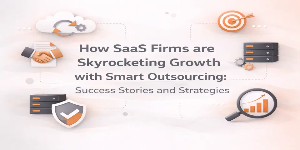
Streamline Your Operations with Tailored BPO Strategies
,
The Future of HR Management in 2025
Finding Your Voice: The Power of Personalized Support
Enhancing Operational Efficiency with Professional Back-Office Support
Listening to Your IT Staffing Needs: An Audio Guide
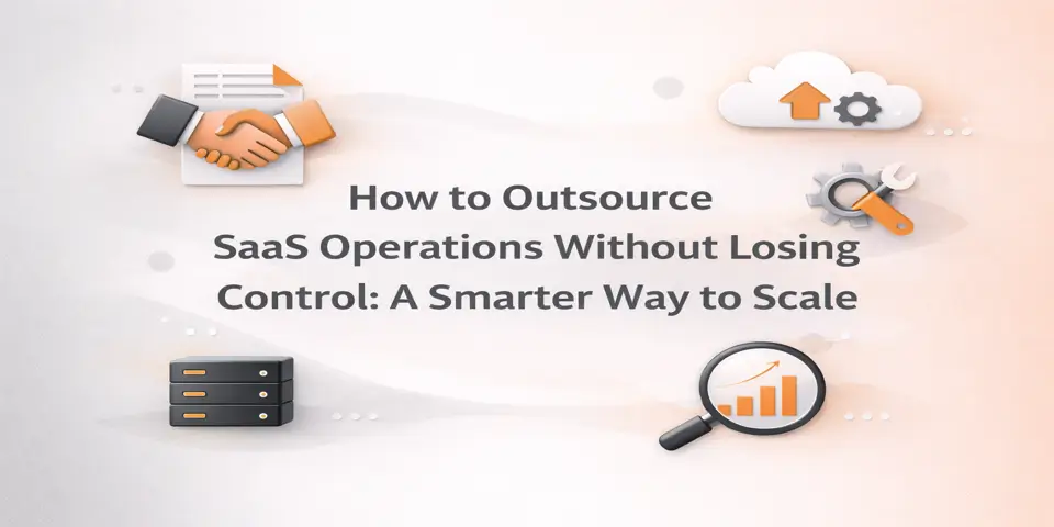
Innovative Outsourcing Techniques for Business Growth
Streamlining IT Services for Maximum Efficiency
The Future of Remote IT Services
Harnessing Cloud Technology for Business Growth
The Future of Global Business: Embracing Innovative Solutions
Branding Beyond Borders: The Outsourcing Advantage
Navigating the Future: AI in Marketing
Offshore Development: Navigating the New Age of Web Solutions
Achieving Global Reach with Local Expertise
The Future of Social Media: Voices in Branding
Proven SEO Practices: How to Stay Ahead in the Game
Listening to Your Brand: Why White Label is the Way Forward.
The Future of Web Development: Embracing Innovations
The Art of Seamless Digital Marketing Partnerships
Navigating the World of Data-Driven Strategies
Making Marketing Personal: A Guide to Growth
The Future of Behavior Tracking in Business
Strategies for Successful Audience Engagement
The Future of AI in Content Marketing
Elevate Engagement with Automated Social Strategies
Strategies for Seamless Content Integration
The Sound of Persuasive Writing – AI Insights
How AI Is Revolutionizing Ad Buying and Organic Search
The Future of Data-Driven Business Strategies
How Cross-Platform Integration is Shaping Modern Business
How Programmatic SEO is Revolutionizing the Online Landscape
Navigating the Targeted Ad Landscape: Tips for Business Growth
The Impact of Data on Customer Insights
How to Protect Your Business from Emerging Threats
Hear the Future: Podcasting Trend Forecasting Insights
Breaking Down Data Silos for Business Growth.
The Future of Data-Driven Decision Making
Engage and Grow with Instagram: A Comprehensive Guide
Optimize Your Business with Advanced Reporting Tools
Engage Customers with Powerful Email Tactics
Enhancing Brand Impact with Storytelling
The Art of Crafting Personalized Emails
Unleashing the Power of Email Automation: An Audio Guide
The Future of Email Marketing: Expert Predictions
Engaging Audiences with Sound and Strategy
The Power of Words: Elevating Your Brand Voice
Listen to Content That Converts
Harnessing Voice Search for Enhanced Engagement
How to Engage Your Audience with LinkedIn Ads
The Art of Storytelling in YouTube Ads
Navigating the World of Facebook & Instagram Advertising
Maximizing ROI with Bing Ads – An Insider’s Guide
Navigating the World of Google Ads: An Audio Guide
Maximize Your Digital Reach with Strategic Link Building
Enhancing Search Engine Visibility through Technical SEO
Listen and Learn: Essential Local SEO Tips
The Role of Audio Content in Enhancing SEO
Unlocking Potential: The Power of Keywords
Instant Engagement through WhatsApp Strategies
Mastering Audience Engagement Through Video
How LinkedIn Marketing Transforms SMEs
Maximizing ROI with AI-Driven Strategies in 2025
Leveraging AI to Scale Your Mumbai Business
How Custom Web Solutions in Mumbai Drive Growth
Mastering Cost Savings Through Outsourcing
The Role of SEO in Scaling Mumbai’s Local Brandsa
Boosting Restaurant Revenue with Digital Marketing
How AI is Revolutionizing the Travel Industry
Maximizing Profit with AI Marketing in Renovation Businessess
The Future of Digital Marketing for Clinics
The Future of AI-Powered Engagement in Online Education
AI-Powered Marketing: The Future for Corporate Services
The Power of E-Commerce SEO in Driving Organic Growth
The Future of Mobile Performance: What You Need to Know
Maximizing Efficiency: Listen to Transformative Insights
Enhancing Website Performance Through Speed
Elevating Digital Experiences with Precision Monitoring
Navigating Website Speed in 2025
Transforming Data into Success Stories
The Future of Data Storage and Backups
Transform Your Brand Voice with Strategic Updates
The Future of Online Security: A Comprehensive Guide
Achieve Business Breakthroughs with Predictive Analytics
How UI/UX Optimization Boosts User Satisfaction
Engaging Digital Users Like Never Before
The Future of User Experience Design: Insights for Digital Growth
The Role of Prototypes in User Experience Mastery
Bridging the Gap: The Future of Business Integrations
How Custom Web Apps Can Revolutionize Your Business
The Sound of Innovation: Scalability Explained
The Sound of Success: Adopting Cloud Solutions
The Future of Web Experience with PWAs
Transformative Power of Bespoke Solutions
The Sound of a Successful Website Strategy
Elevate Your Brand with Innovative CMS Platforms
WhatsApp us
